
Volo is a concept airline and app developed in response to a design brief calling for an app that would be like Uber for flying. Functionally, it does not differ from other airline apps, but it emphasizes being sleek and simple.
Timeframe
4 days (2020)
4 days (2020)
UX Techniques
Lo-fi sketches, Wireframing, Prototyping, Usability testing
Lo-fi sketches, Wireframing, Prototyping, Usability testing
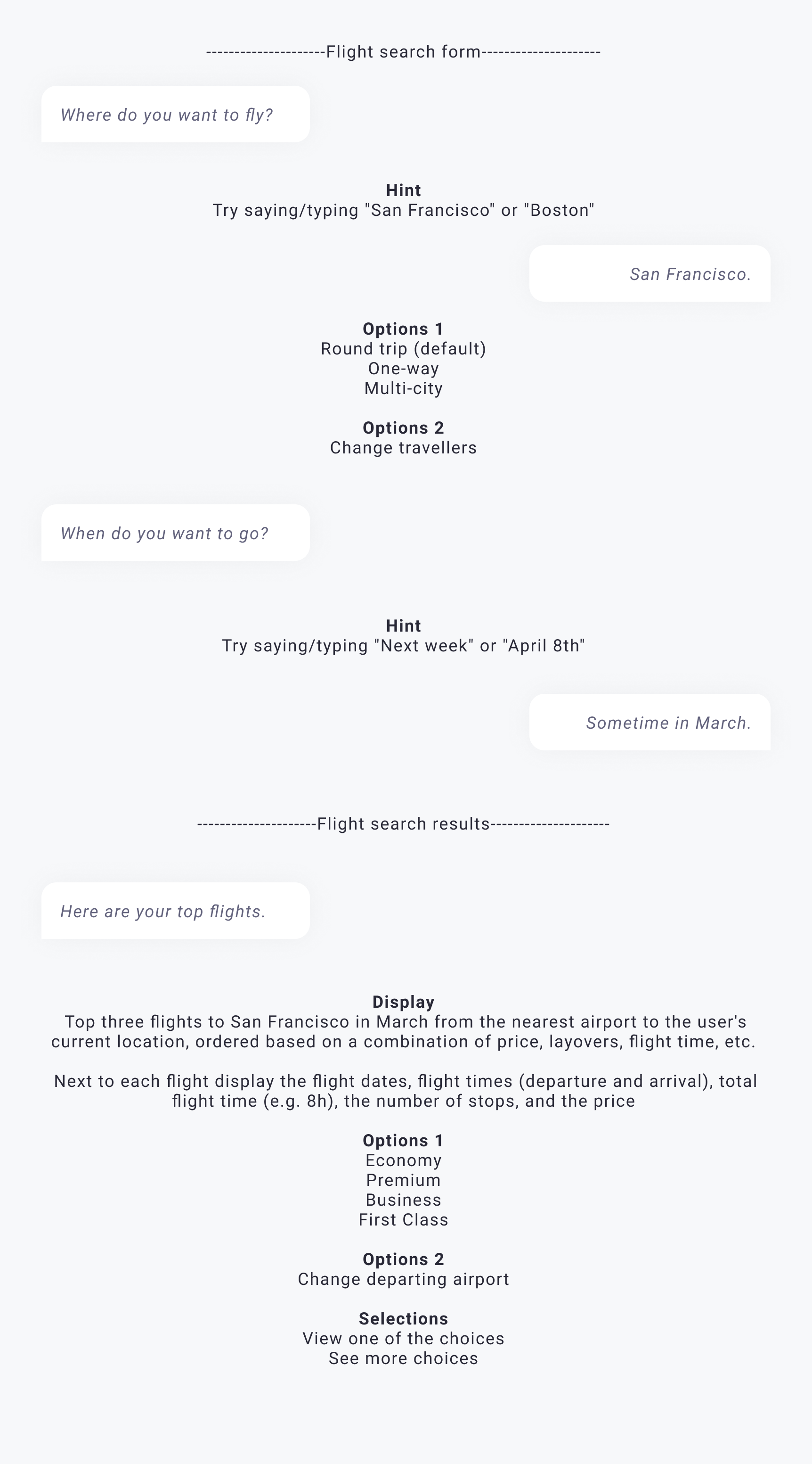
Starting with conversation
I approached the flight search and booking flow by thinking of it in terms of a conversation one might have with a travel agent.
With conversation, information comes out gradually. We often use non-verbal cues to determine the context. In an app, a user's past behaviour and location data can provide context to make starting assumptions. As I wrote the user-flow script, I hypothesized that most of the user's information was known before they started their search.
Initial user-flow script for booking flow
Thinking about the user
I came up with a proto-persona to guide the development of the user-flow. Through research, I discovered that business executives represent a category of users who often fly with a single airline and prioritize ease, simplicity, and comfort over the lowest price. While occasional travellers may want to compare prices across airlines, frequent flyers are more likely to use a single airline and its dedicated app. With this proto-persona in mind, I focused my efforts only on the aspects of the flow most relevant to this kind of user.
Finding a voice
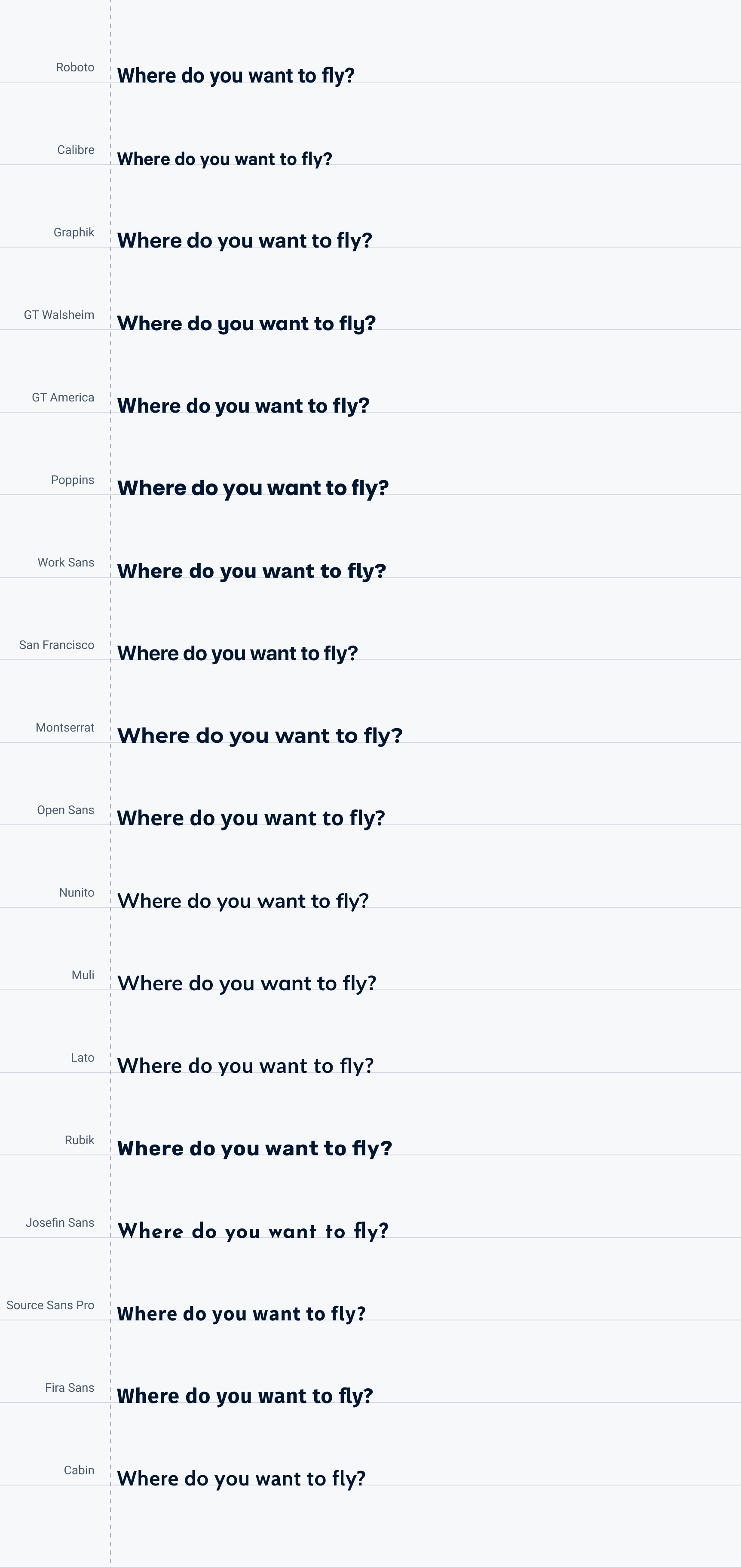
I began my exploration of the brand through typography. Guiding my search was the desire for a sharp and clean typeface that still gave off some personality.
Volo comes from the Latin for wish, speed, and fly and means flight or fly in Italian. The Latin root ensures broad understanding across Romantic languages while lending a sense of familiarity to English speakers.
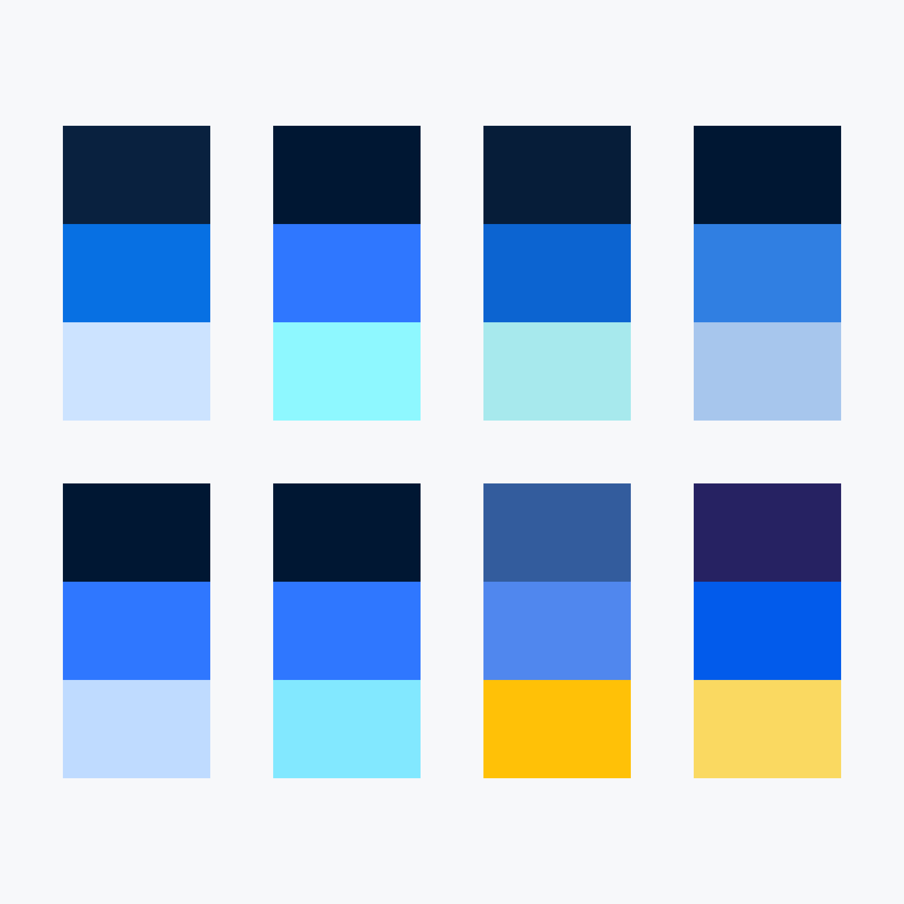
Colour swatch explorations
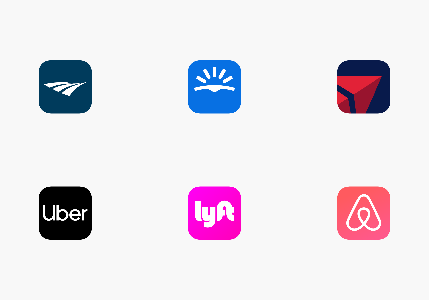
Reference app icons
My thoughts around an icon design began with exploring simplified airplane shapes. As it happened, the "v" in Volo was well-suited to this purpose.
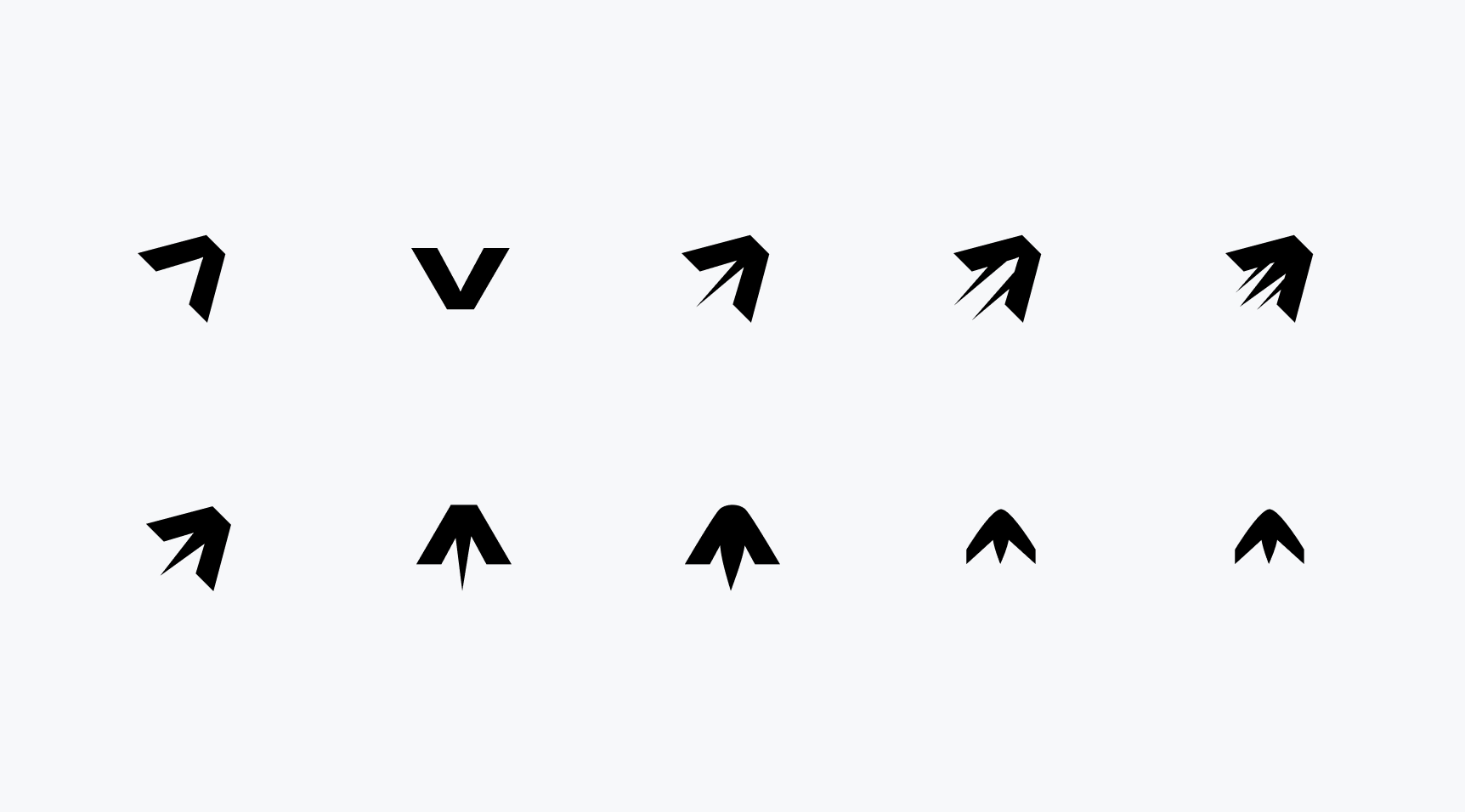
App icon shape exploration
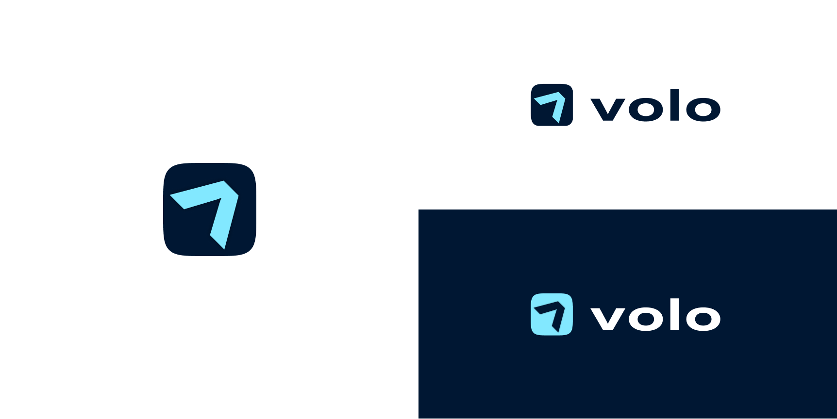
App Icon
The V from Volo suggests an airplane and forward motion. The simple design emphasizes clarity.
Colour
Volo's colour theme uses a primary colour (dark blue) and two secondary colours (aqua and blue).
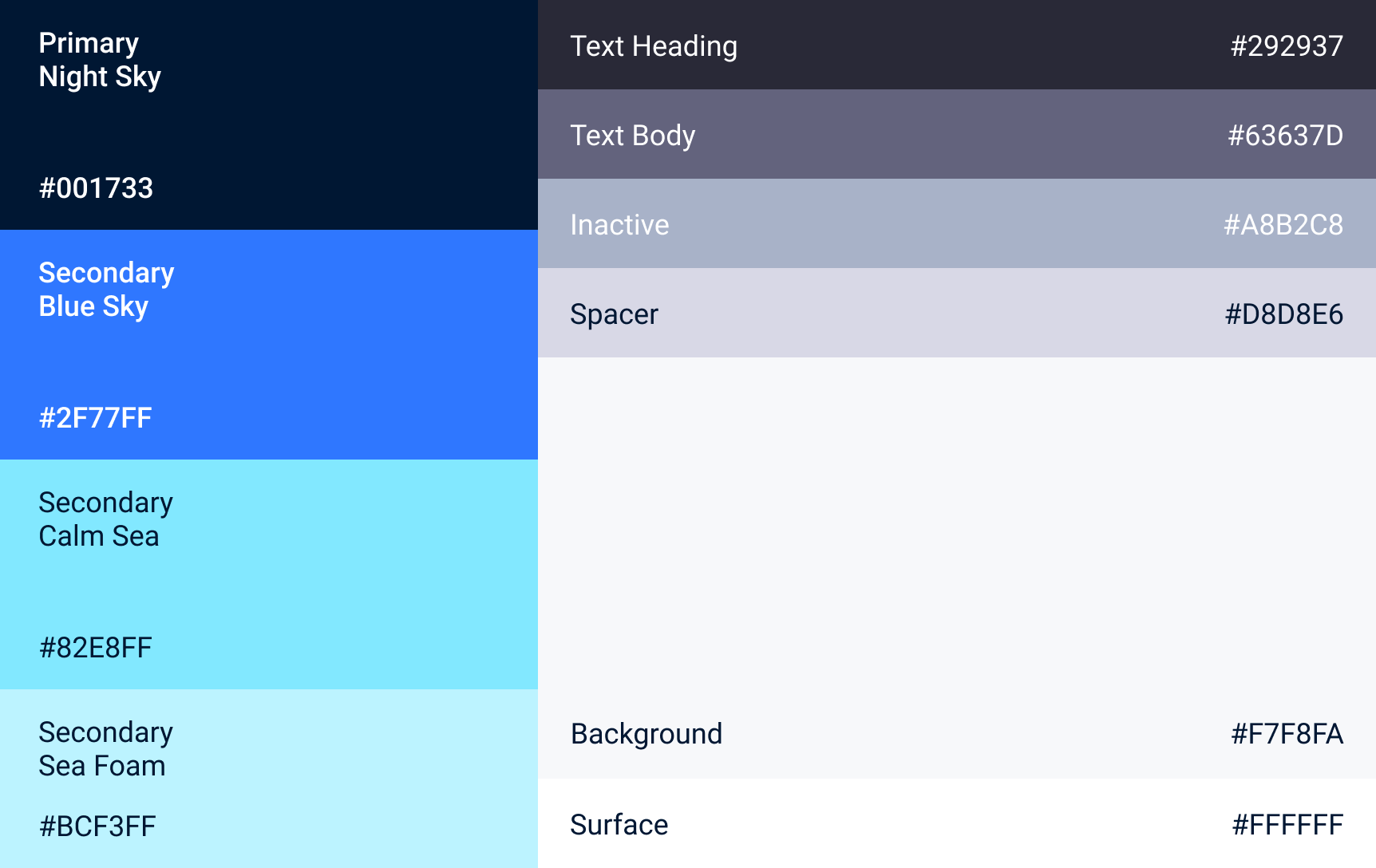

Neutral tones dominant the interface, allowing the accent colours to stand out, highlight information, and direct the user's next course of action.
Soft shadows help to provide surface definition without detracting from the clean, sleek feel.
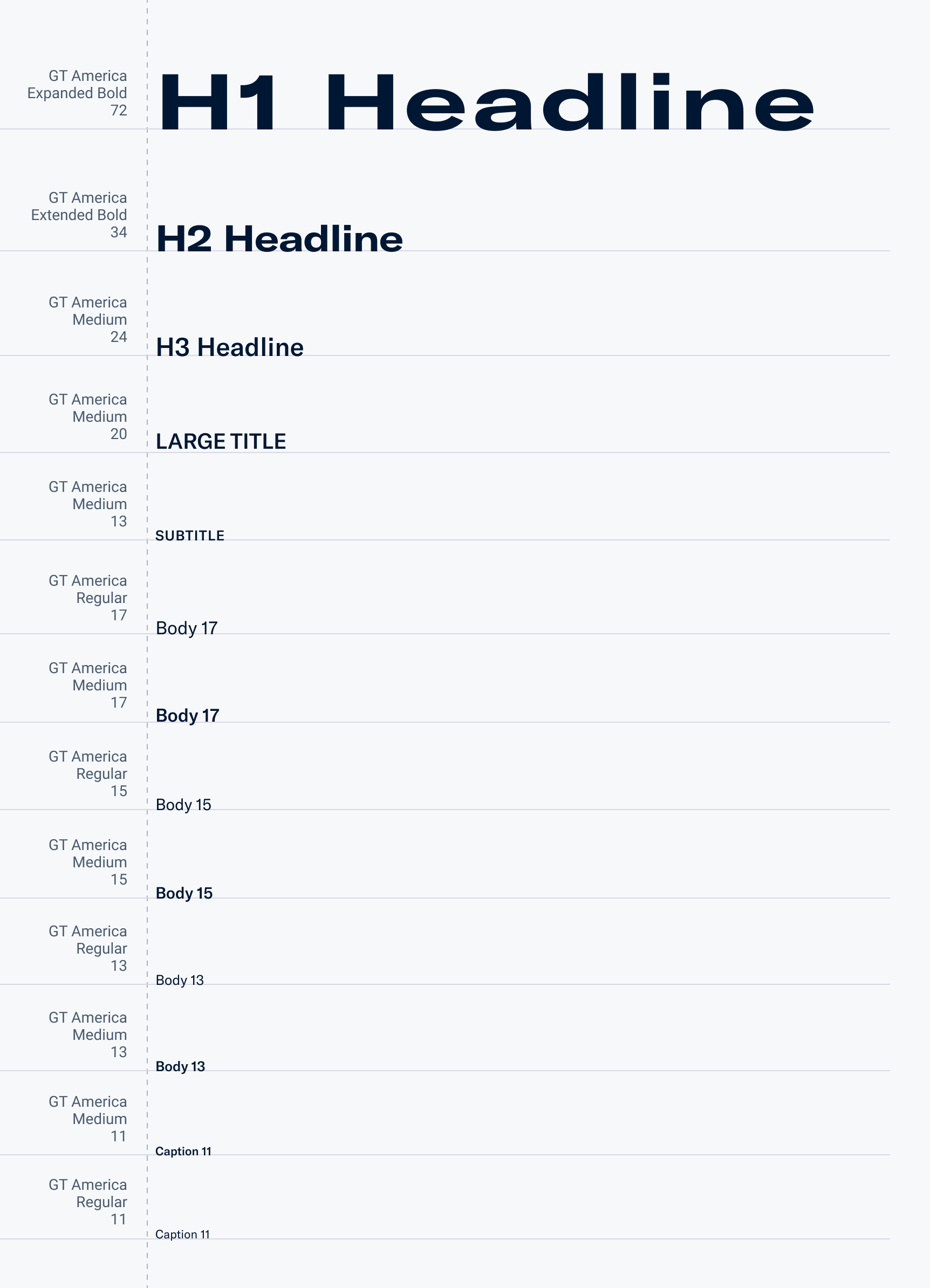
Typography
Volo uses GT America as its typeface both for the brand and the interface, providing continuity through all customer touchpoints. The expanded and extended styles give a distinct feel and sense of motion to headlines and the wordmark.
Iconography
The iconography in Volo complements the typography with a combination of sharp strokes and rounded forms. They are simple and follow established conventions.

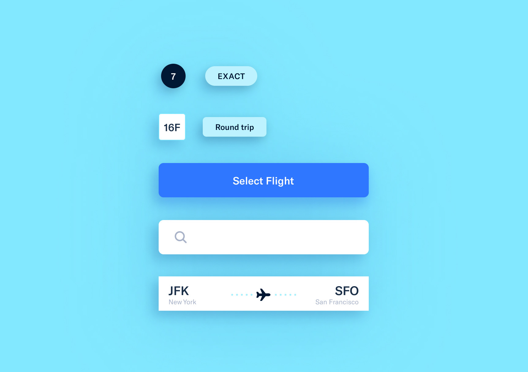
Shape
A single dominant circle representing the globe provides the app with a sense of motion. Inputs and cards have rounded corners while the primary booking form has crisp edges providing a sense of precision and calling back to paper forms, tickets, and receipts.
Motion
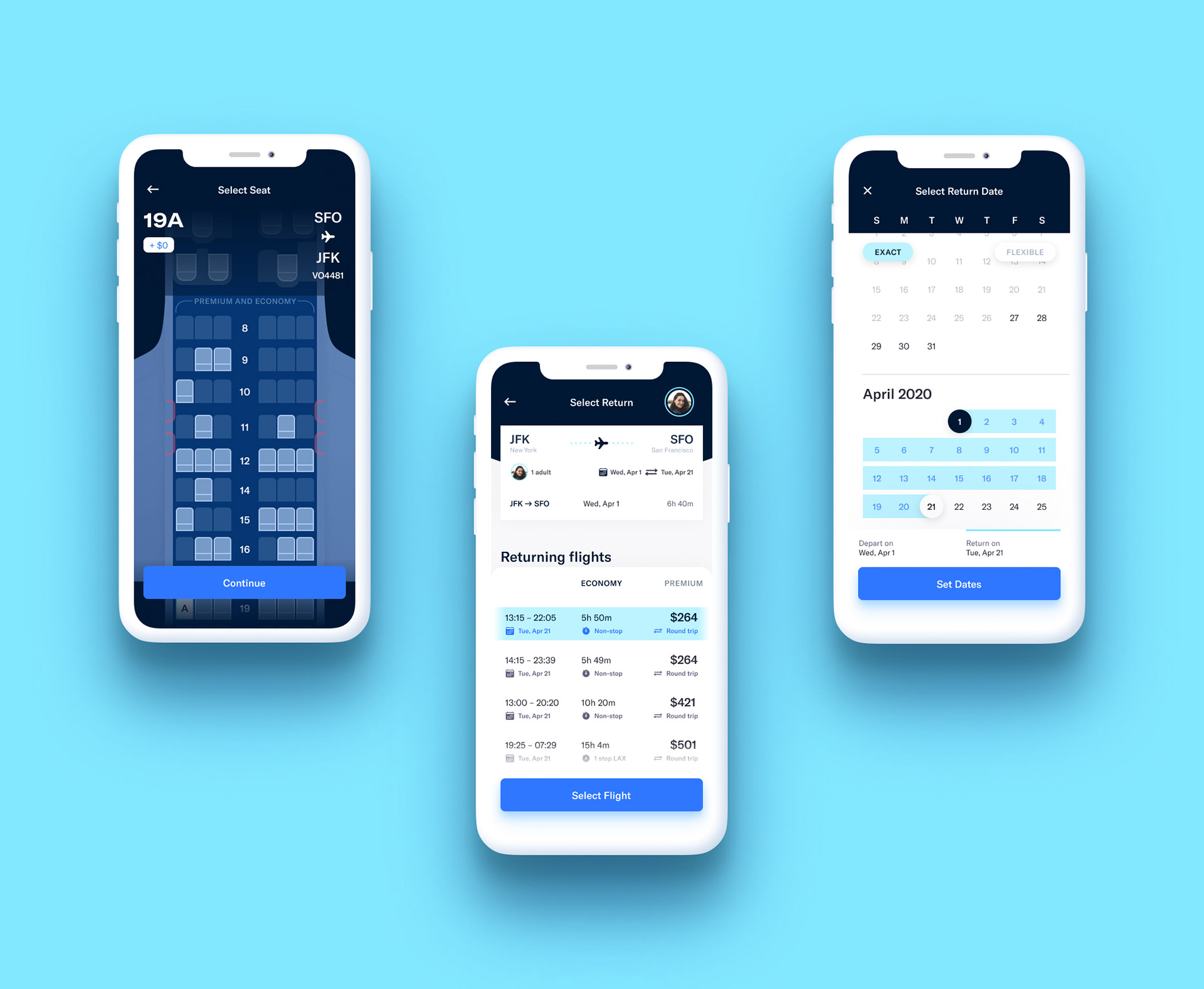
Upon first selecting seats for a flight, an animation plays of the plane coming into view. The animation provides a sense of continuity and communicates the idea of a seamless experience from the app to flight.
Guiding Lights
I looked at airline apps United and Westjet as part of my research. However, I found Lyft and Uber to be much more valuable reference points from the perspective of the overall user experience.
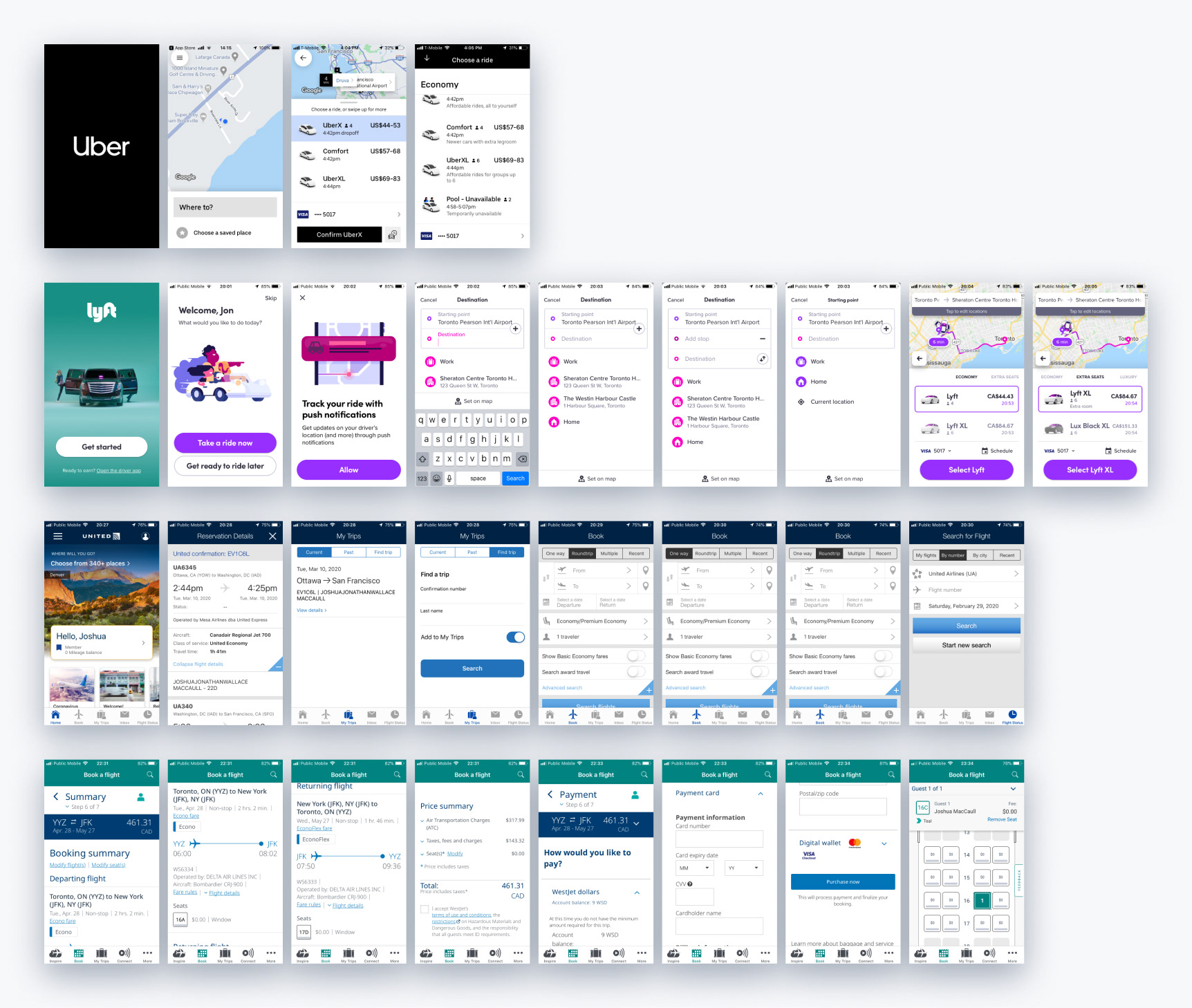
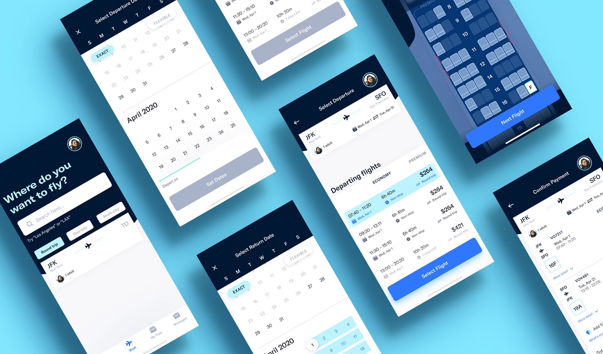
Search
Users begin their journey by answering a simple question: where do you want to fly? Text or voice input allows them to respond most naturally.
The user's departure airport is assumed based on current location and past usage. Users can tap the form to modify the departure airport, the number of travellers, and the type of trip.
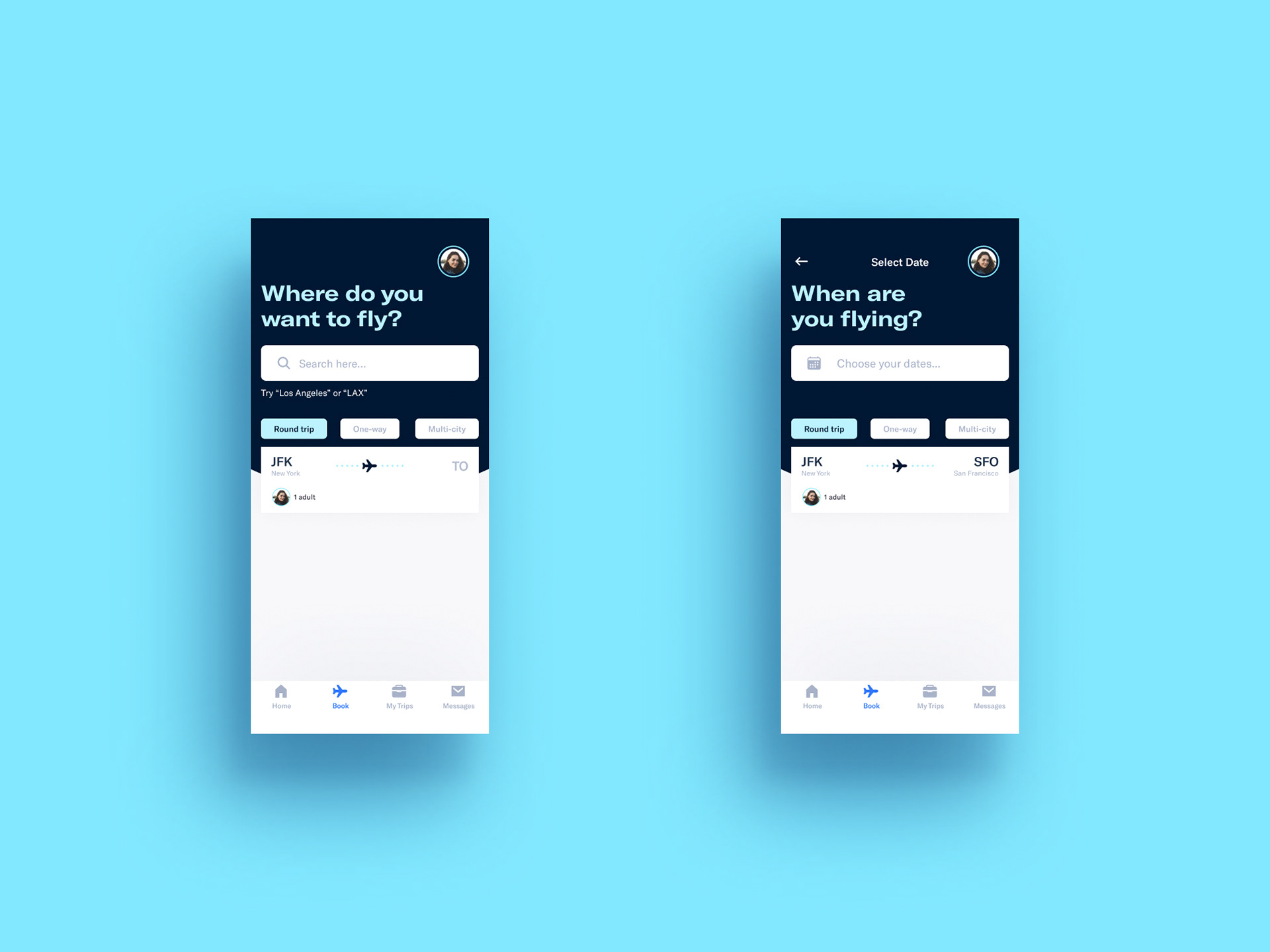
Being flexible
Within the calendar, users can provide leeway for the time around departure and arrival dates.
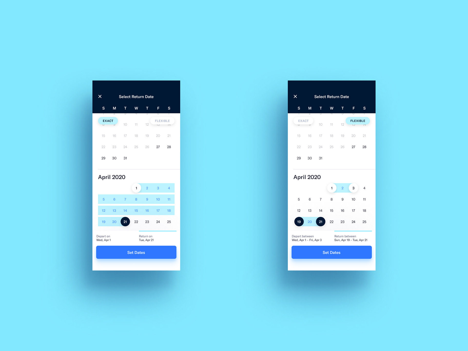
Search results
Flights default to the user's preference (economy, premium, business, or first class), with the top flights appearing at the top.
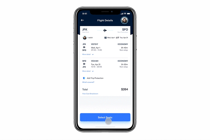
Flight details
From the flight details page, users can see the model of plane and the checked-in baggage restrictions.
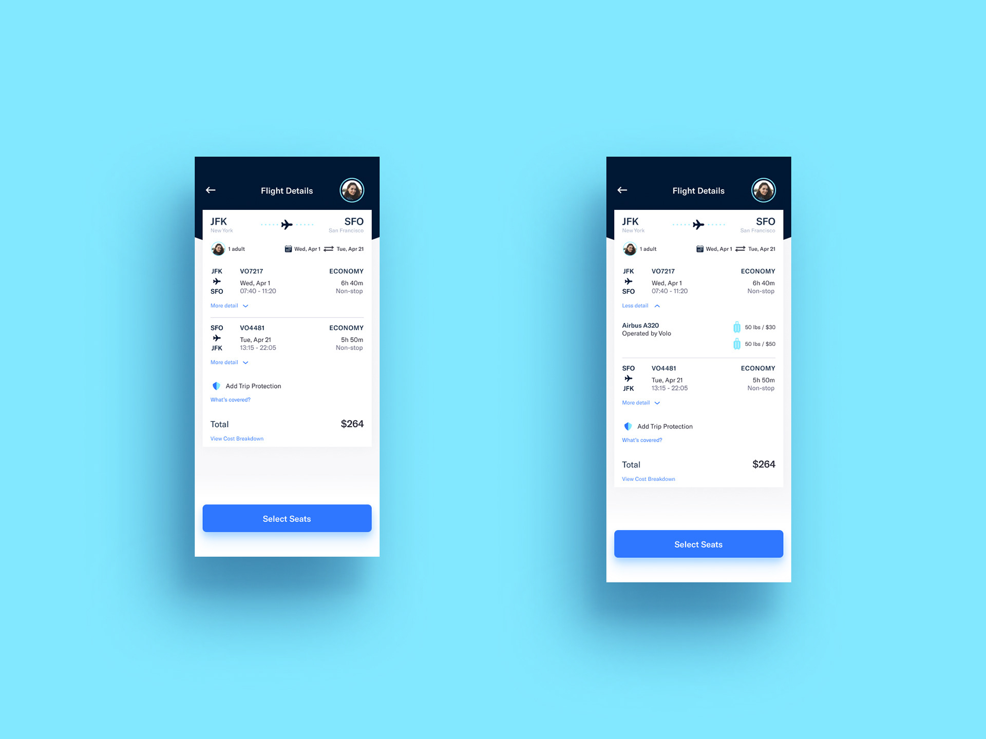
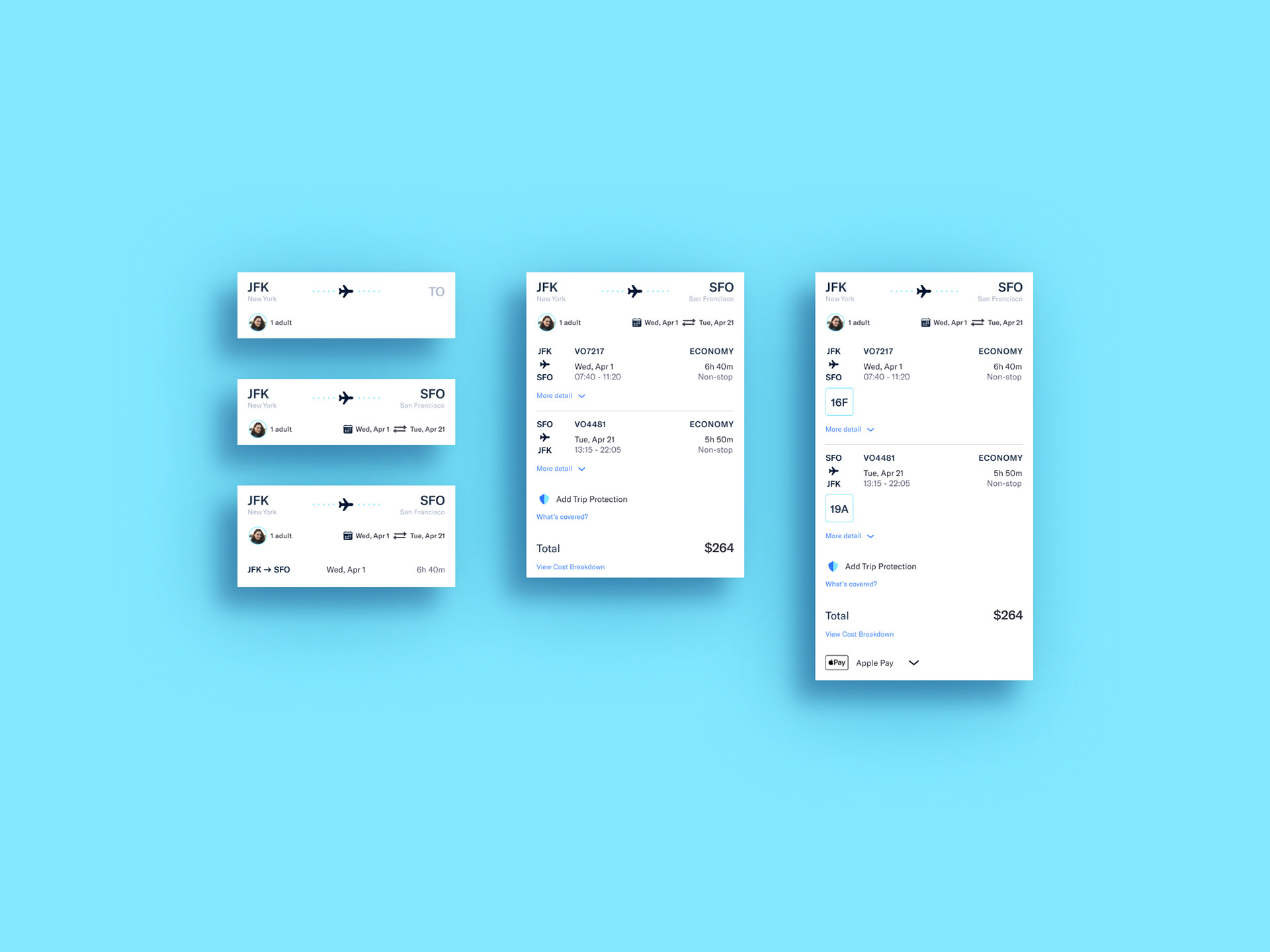
Single form flow
From booking to checkout, the user's decisions progressively add to the form. The form gives the user visibility into the choices that they have made and affords them the ability to modify them. They can become familiar with the displayed information, rather than having to learn new screens.
Checkout
The app takes advantage of user preferences to set the default payment option. The payment method can be changed on a flight-by-flight basis to accommodate users who may need to use multiple company cards.
Prototype
View the prototype here.
Takeaways
I found this design challenge to be a useful exercise in applying an abbreviated UX process while expanding my design skills. Establishing the visual design early came as a refreshing change as it helped make the screen design process easier by providing some soft guidelines. Having a narrow focus on just the booking flow meant that I could ensure the screens related to each other clearly and consistently.
The app is a reasonable starting point, and it would be interesting to see how the design could progress with more thorough user research and usability testing. Finding the opportunities where the design can seem magical requires research to uncover.
I had hoped to incorporate more animation and smoother transitions into the design but found myself pressed for time and limited by my knowledge with more advanced prototyping and animation. The experience helped to highlight areas where I need to pursue further development of my craft.