
Fast Tracks is a simple progressive web app (PWA) for discovering new music. It offers Spotify users a simple way to discover new music on-demand by leveraging Spotify's music recommendations algorithms.

Finding an Angle
Fast Tracks began as a simple means for me to learn and experiment with code, getting familiar with React in the process. Users could search for a song and see results from the Spotify API. However, I hypothesized that search was low-value to users: Spotify listeners are accustomed to having music brought to them rather than seeking it out and search functionality is readily available within the app. In my use of the app, a personal pain point was the Discover Weekly playlist – waiting a week for new music was inconvenient. I decided to replicate the Discover Weekly experience but daily.
As I was developing the app, I built certain functionality around testing rather than the intended final experience. Among these was the ability to get a list of tracks on-demand. As I considered implementing the daily algorithm, I realized that it merely replicated the frustrations of the Discover Weekly playlist. The "development mode" implementation offered a more compelling alternative to the default Spotify paradigm.
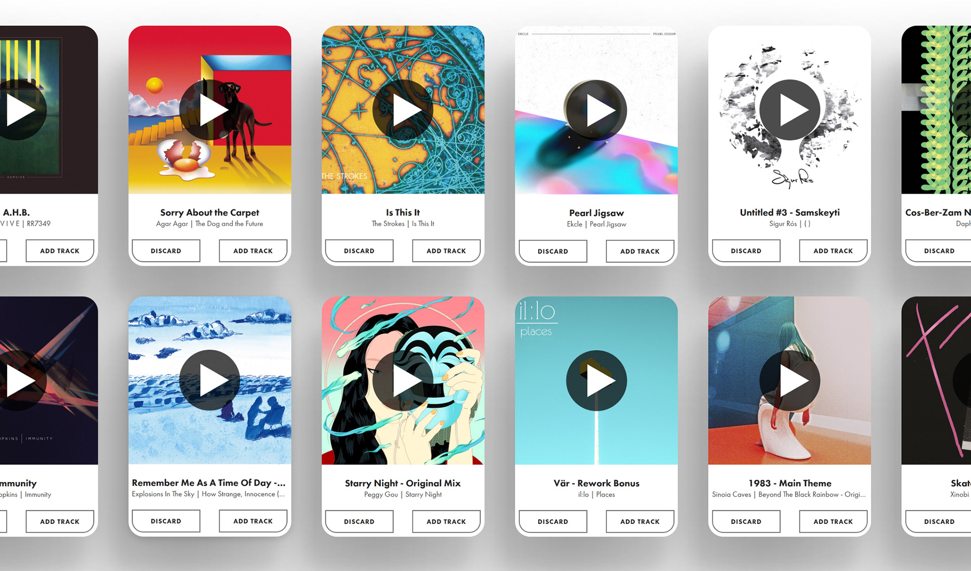
No More Lists
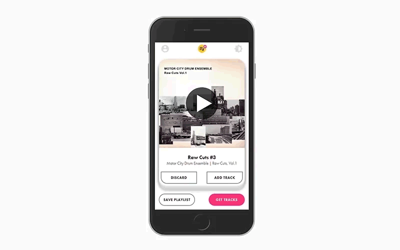
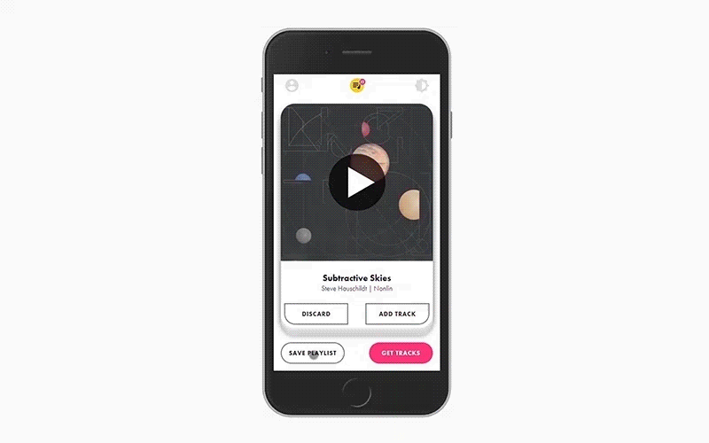
Long lists represent sources of cognitive load and anxiety as we feel compelled to look over every item. I used a metaphor of a deck of cards and Tinder-style "Like" and "Dislike" actions to keep the focus on one song at a time.

A Minimal Approach
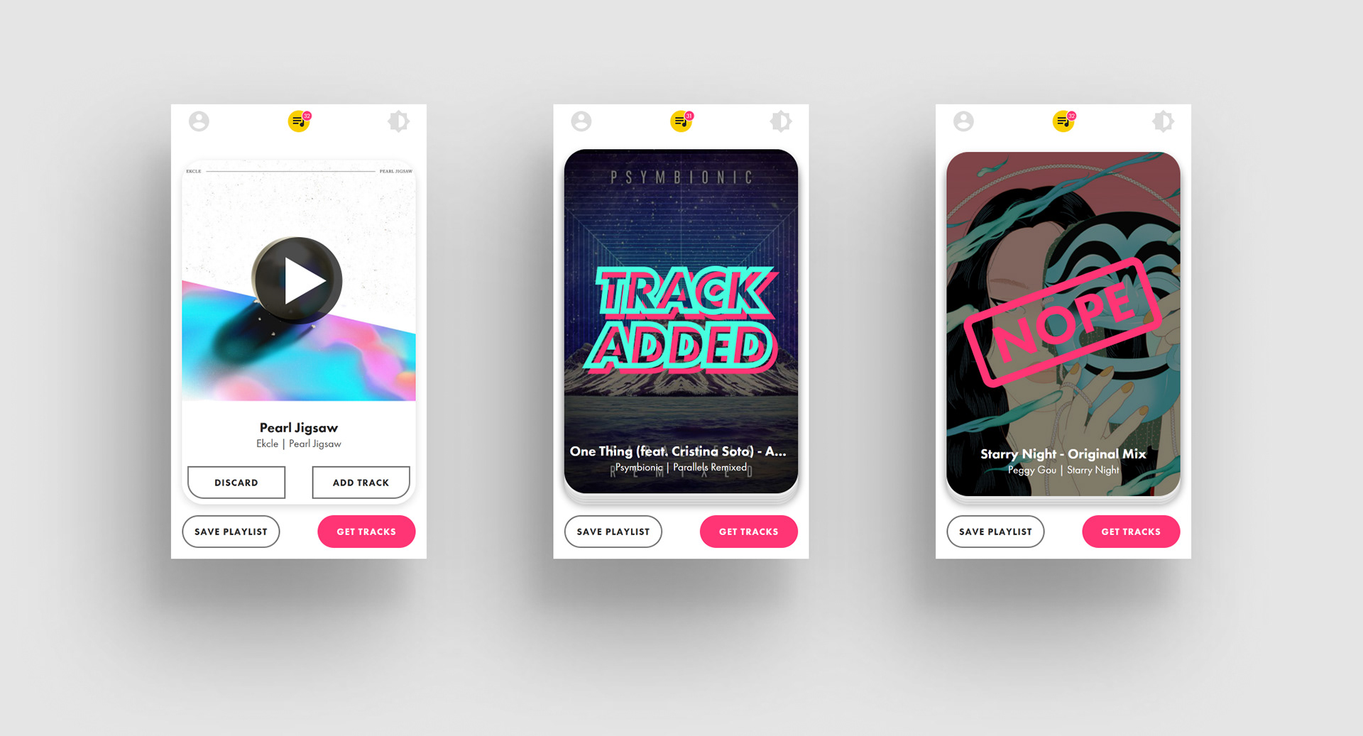
I aimed to keep the interface unobtrusive while remaining clear and identifiable. While the intended feel for the app was game-like, the focus is on the content – the music tracks and accompanying album art – rather than the scaffolding around it. This approach served well when it came to designing for light and dark modes, as there was comparatively little to be switched between.

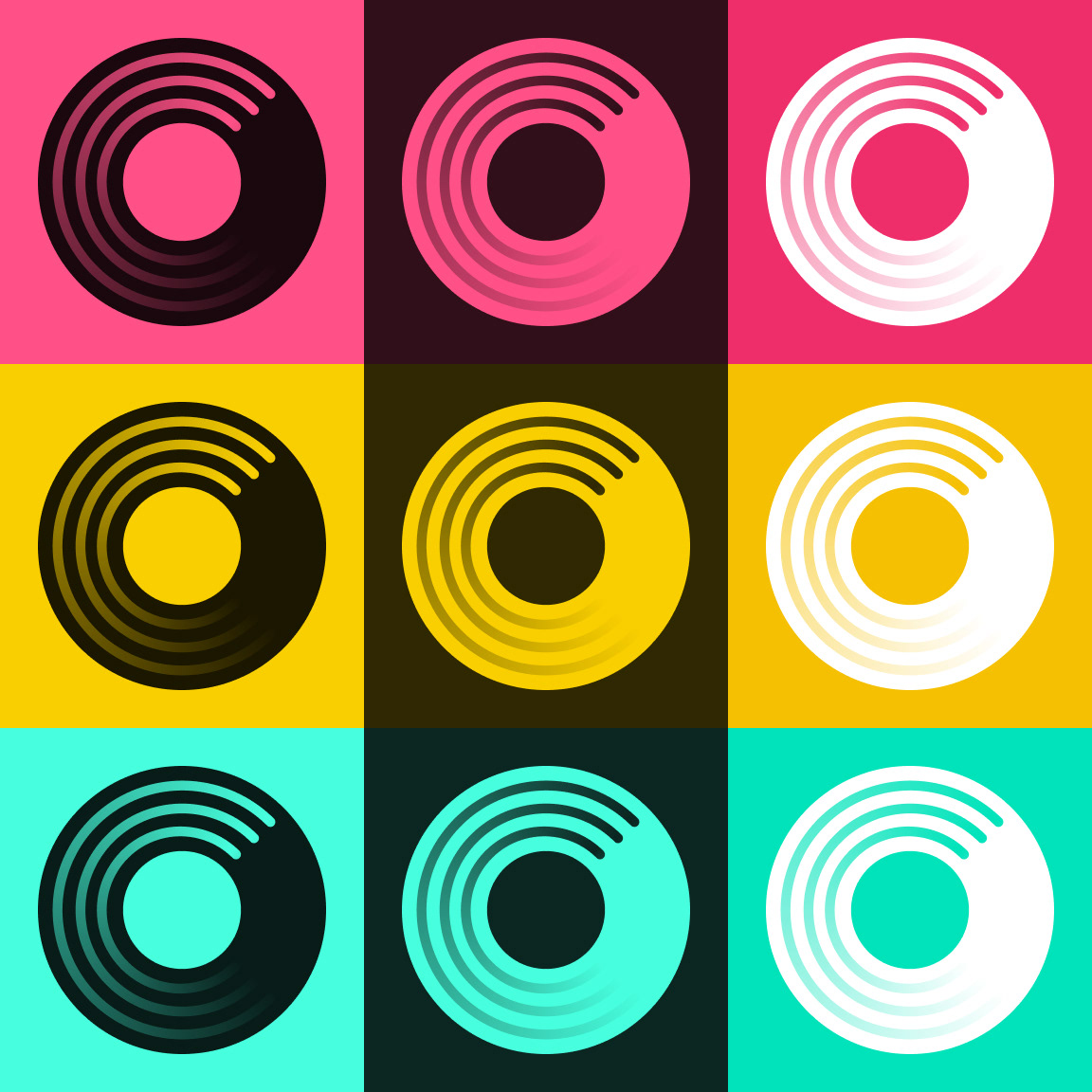
Putting a Spin on Things
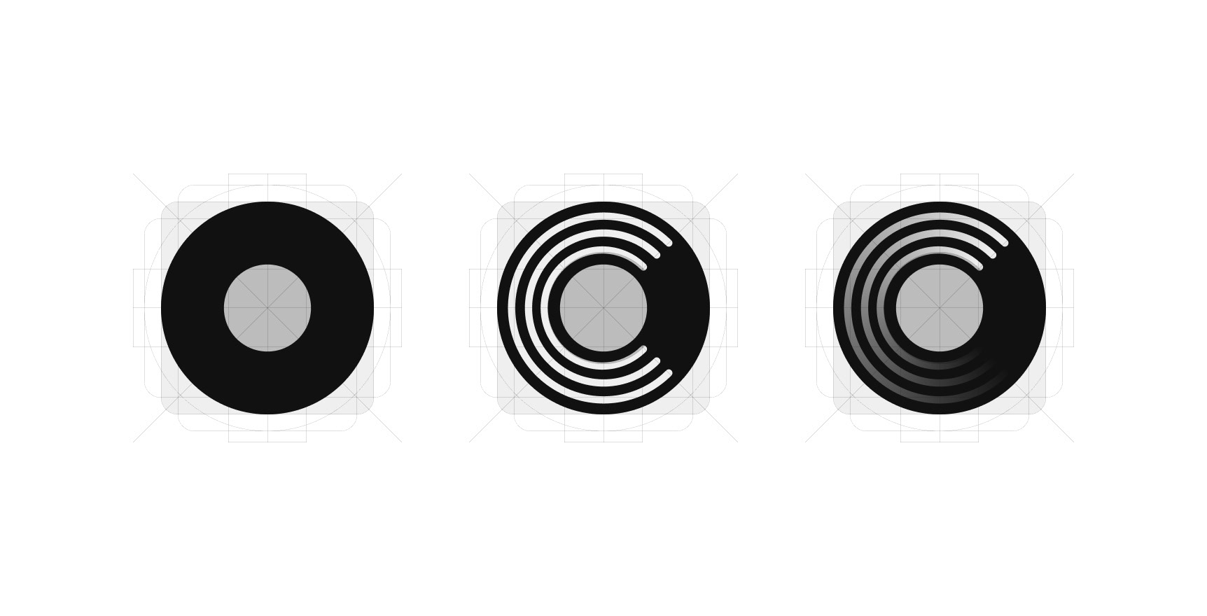
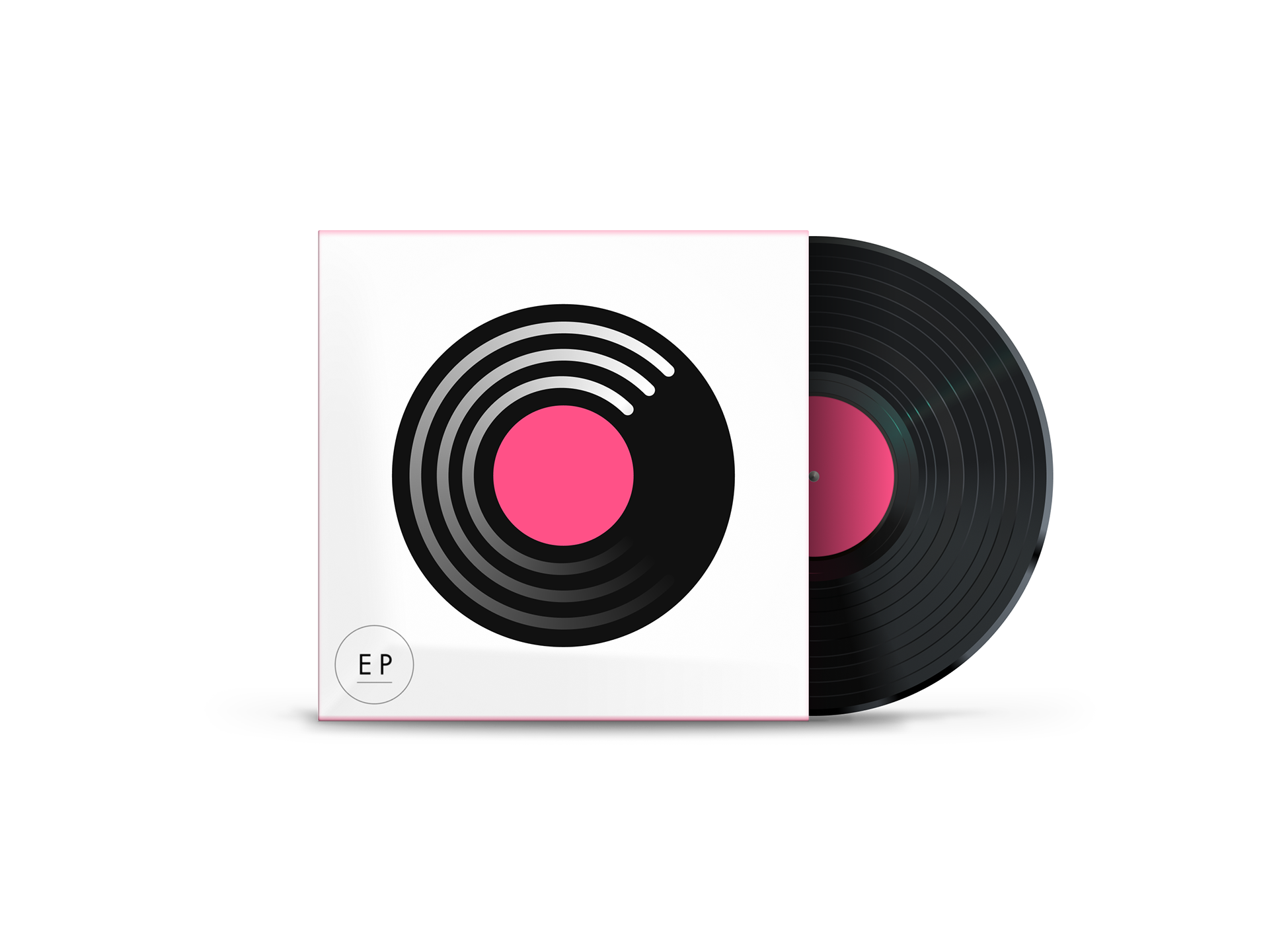
I designed a detailed vinyl record illustration for use when saving a playlist and developed simplified variations for other contexts, with the most basic design serving as the app logo. I experimented with different colour variations on the logo but ultimately went with the clarity offered by the high-contrast black-on-white design.

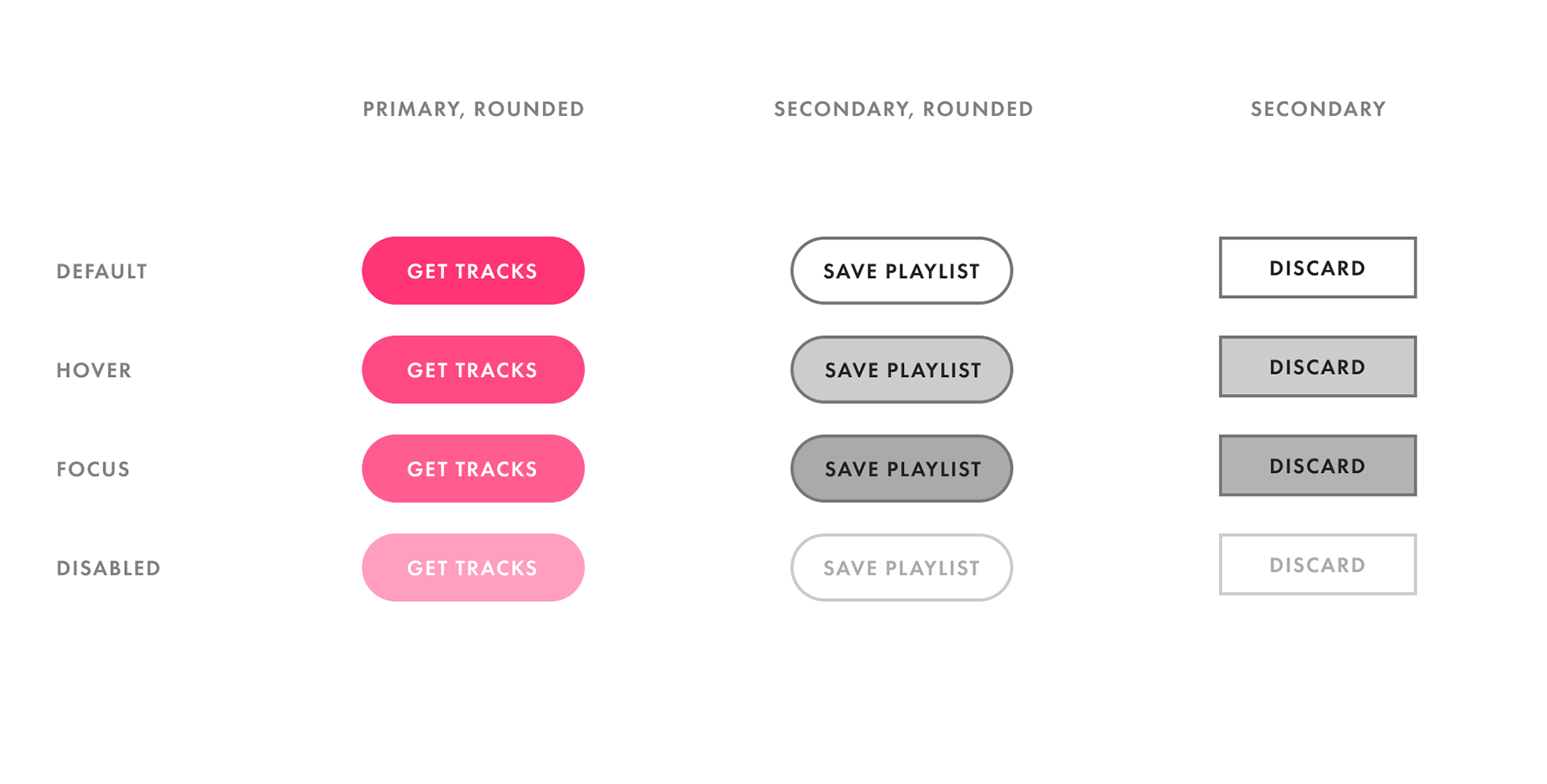
Clarifying the Actions
Early on, I experimented with using icons on mobile, but users became confused about what they meant. Sticking with text labels kept the actions understandable to new users.
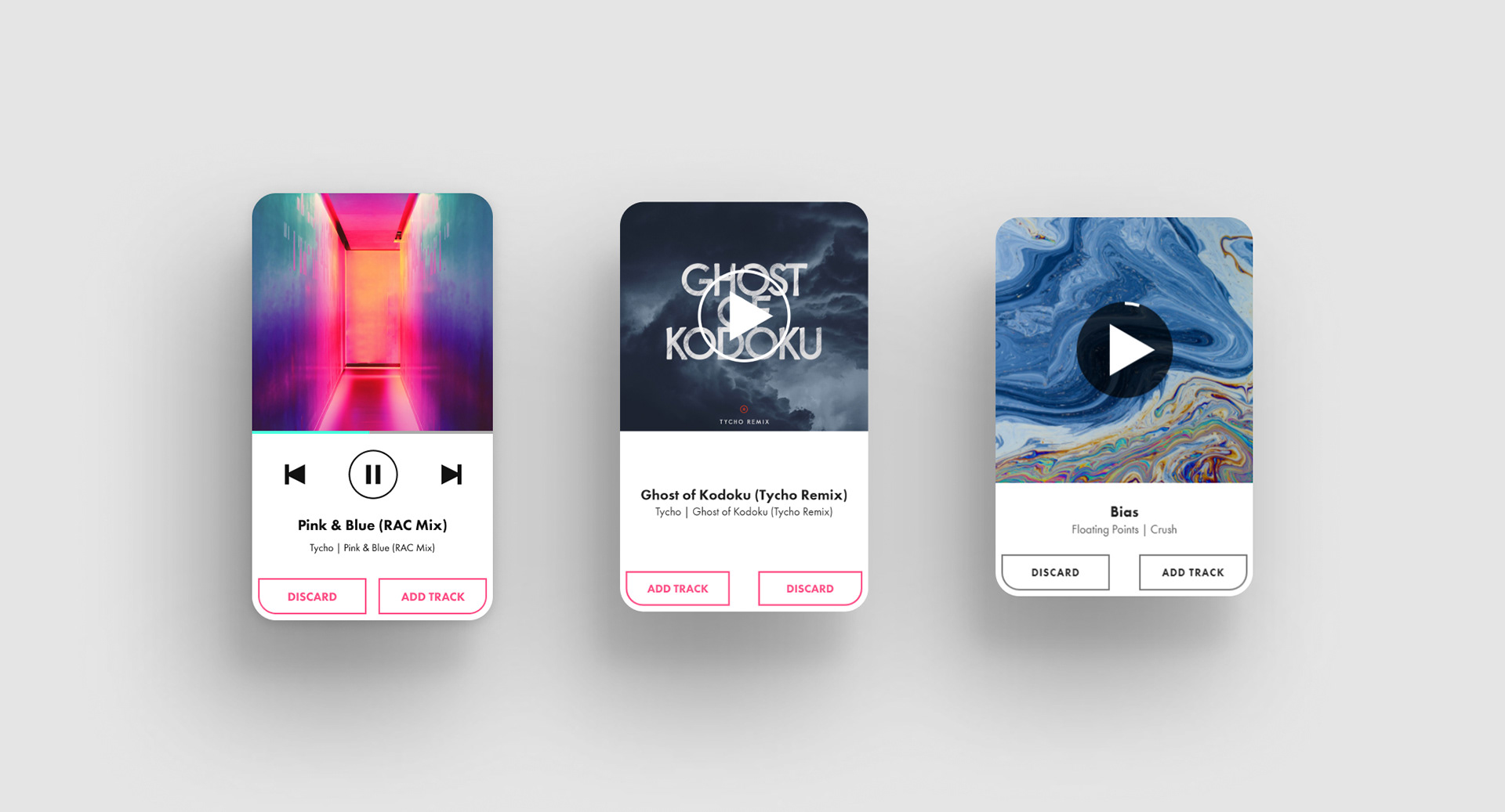
Track Card refinement: I used quick iterations to simplify the actions and information presented on the cards.
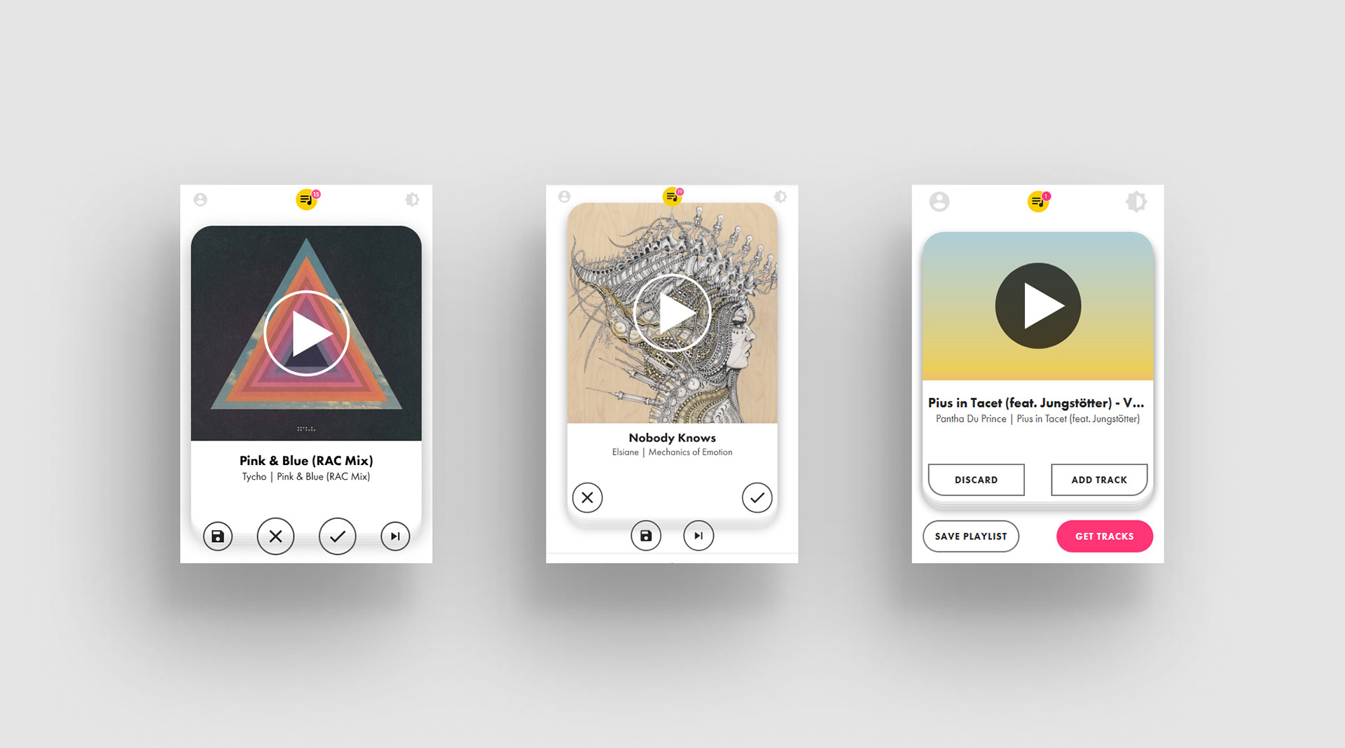
Track Action Experimentation: Users preferred the card actions to be on the card themselves, while text labels were less confusing than icons.
RESPONSIVE DESIGN
In designing across mobile, tablet, and desktop displays, I aimed to play to the strengths of each screen. On tablet and larger displays, the playlist is always visible, giving the user greater visibility into the system while keeping the basic layout from mobile. Although the target is portrait orientation on mobile, I made adjustments for landscape orientation to ensure the experience was still functional.

Keeping User Preferences in Mind
In addition to incorporating light and dark themes, I used the user's preference to decide the theme to present upon startup. Doing so helps ensure that their first experience with the app will feel natural. If the user changes the setting, the app remembers their preference.

Designing for Delight
Animations and illustrations emphasize the fun and casual nature without becoming obtrusive or interfering with the minimal interface. Celebratory text for adding a track and saving a playlist spins into view, inspired by the spinning of a vinyl record on a turntable.
Removing a track from the playlist causes it to gracefully leave the list, rather than an abrupt and instant exit.
The track indicator grows in size whenever a song gets added to the playlist. The animation draws the user's eyes, communicating a song addition even while the playlist is off-screen.
Rather than presenting the user with a blank screen, a looping record greets them, preventing the empty state from appearing broken.The cards enter the screen in a quick and orchestrated manner. It feels fast and precise, building confidence in the app.
Keeping an Eye on Performance
While writing a highly performant app was beyond my coding expertise, I didn't want to sacrifice user experience. I used performance profiling and manual testing to optimize the app, removing unnecessary component updates due to state changes until it felt suitably responsive.
Real Recommendations
With access to the Spotify API, I was able to leverage its recommendation engine, showing each user a personalized set of tracks. The Spotify API provides a recommendations endpoint that can generate recommendations based on a list of seed tracks, seed artists or a combination of both. I opted for a simple implementation as a start; the app generates recommendations from a random sample of the user's recently listened to tracks.
Opportunities
Focus on the Aural Experience
While the look and feel of the app are smooth, listening is another experience. Tracks start and stop abruptly, and there is no ambient music or sound to fill the space between tracks. Taking time to focus on the aural experience of the app would enable it to shine.
While the look and feel of the app are smooth, listening is another experience. Tracks start and stop abruptly, and there is no ambient music or sound to fill the space between tracks. Taking time to focus on the aural experience of the app would enable it to shine.
Chrome Plugin
As a Progressive Web App, users can install the app on their phones and interact with it as a native app, keeping it always at their fingertips. However, on desktop, the experience is not quite as convenient. Developing the app as a Chrome plugin would enable users of Chrome to open it up as a small app window from the plugins toolbar, effectively replicating the mobile experience.
As a Progressive Web App, users can install the app on their phones and interact with it as a native app, keeping it always at their fingertips. However, on desktop, the experience is not quite as convenient. Developing the app as a Chrome plugin would enable users of Chrome to open it up as a small app window from the plugins toolbar, effectively replicating the mobile experience.
Keyboard Shortcuts
While I took care to ensure all actions in the app were accessible – keyboard focus-able with appropriate labels – using the app this way requires tabbing through the various functions. A set of keyboard shortcuts would enable keyboard-users to use the app quickly and efficiently.
While I took care to ensure all actions in the app were accessible – keyboard focus-able with appropriate labels – using the app this way requires tabbing through the various functions. A set of keyboard shortcuts would enable keyboard-users to use the app quickly and efficiently.
Putting products into the hands of users often leads to surprising discoveries. Therefore, while I foresee many ways to improve the app, I am excited by unexpected insights to come.
App
View the app here.
Takeaways
Developing this app exposed me to a wide-range of React concepts and tools. I dealt with animation-integration using the Framer Motion library, managed state with reducers and the Context API, managed authentication and redirects with React Router, and used component composition for more readable code. It was often an exercise in frustration, but ultimately it helped me to think more concisely about my design. I also strengthened my knowledge of CSS, particularly in achieving similar cross-browser appearances. Being limited in scope also allowed me to polish each aspect of the design, upgrading my motion design skills in the process.