
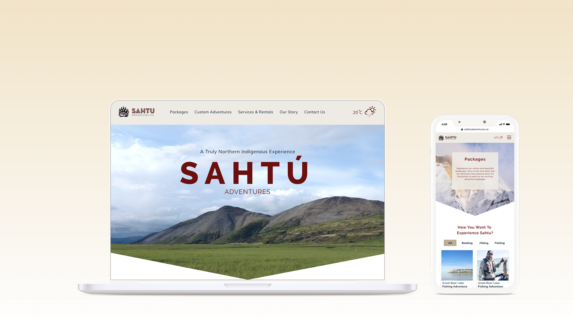
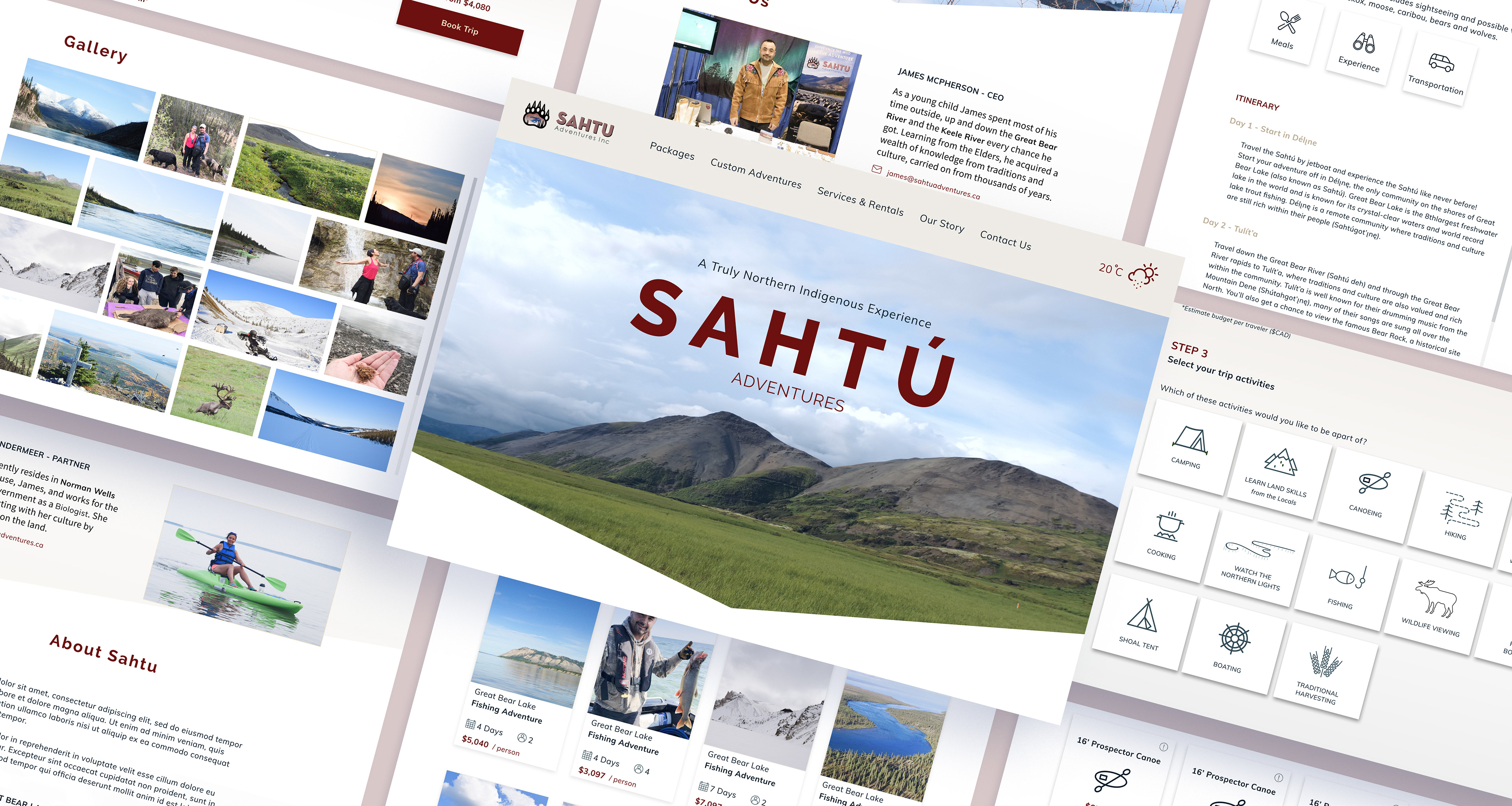
Sahtú Adventures is an indigenous cultural and adventure tourism provider based out of Norman Wells, Northwest Territories. Run by locals James McPherson and his partner Jennie, Sahtú offers boating and camping trips from Great Bear Lake up to the Arctic Circle. I worked alongside five other designers to develop a responsive website redesign for Sahtú Adventures, incorporating online booking and custom adventures.

My Role
UX Designer
UX Designer
Tools
Zoom, Slack, Trello, Google Suite, Miro, Adobe Photoshop, Figma, Keynote
Zoom, Slack, Trello, Google Suite, Miro, Adobe Photoshop, Figma, Keynote
Team
Cerise McKay, Sakin Egal, Viktorija Gjorgjievska, Kim McKinnon, Kathy Li
Cerise McKay, Sakin Egal, Viktorija Gjorgjievska, Kim McKinnon, Kathy Li
Timeframe
3 weeks (2019)
3 weeks (2019)
Discovering our travellers
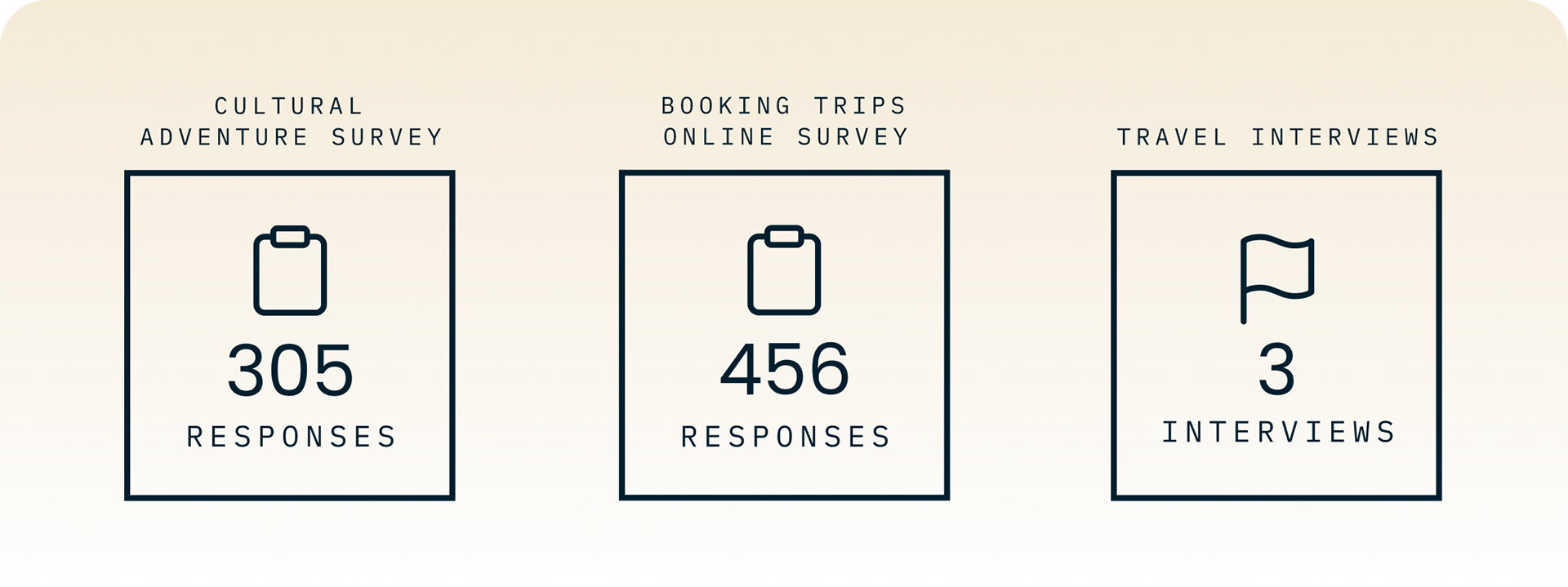
I took up the task of writing and deploying online surveys to find our target audience. I sent out two surveys, one focused on cultural tours, and one more generally focused on online booking on tablets and mobile. I sorted through the qualitative answers using affinity diagrams.

Expectation for online booking
People would abandon making a booking if they couldn’t complete it online.
People would abandon making a booking if they couldn’t complete it online.
Desire for pre-set packages
A portion of the audience preferred pre-set packages to customization.
A portion of the audience preferred pre-set packages to customization.
Concern over authenticity
A large concern among travellers was the authenticity of the tour provider.
A large concern among travellers was the authenticity of the tour provider.
Communicating clearly to users
As we went through Sahtú's offerings we realized that it was easy to get confused. Our challenge was categorizing the varied items so that users could understand them at a glance.
I helped to define the information architecture where we came up with the categories of Packages, Custom Adventures, and Services & Rentals to group Sahtú's offerings. We prioritized the order of the offerings based on feedback from our research.
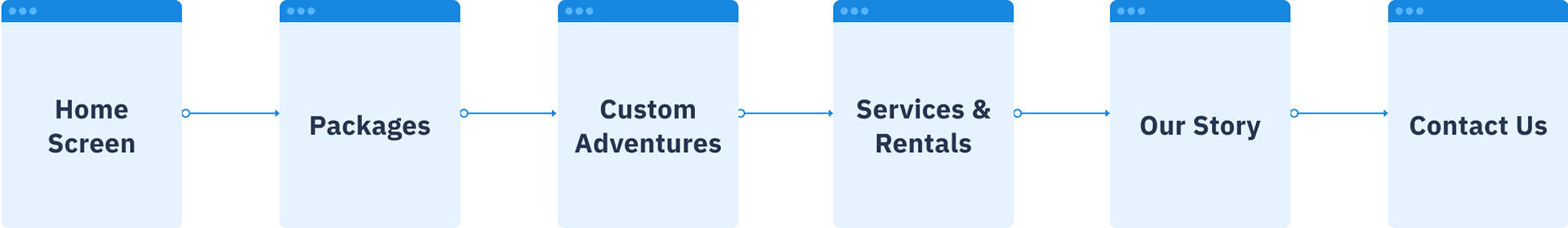
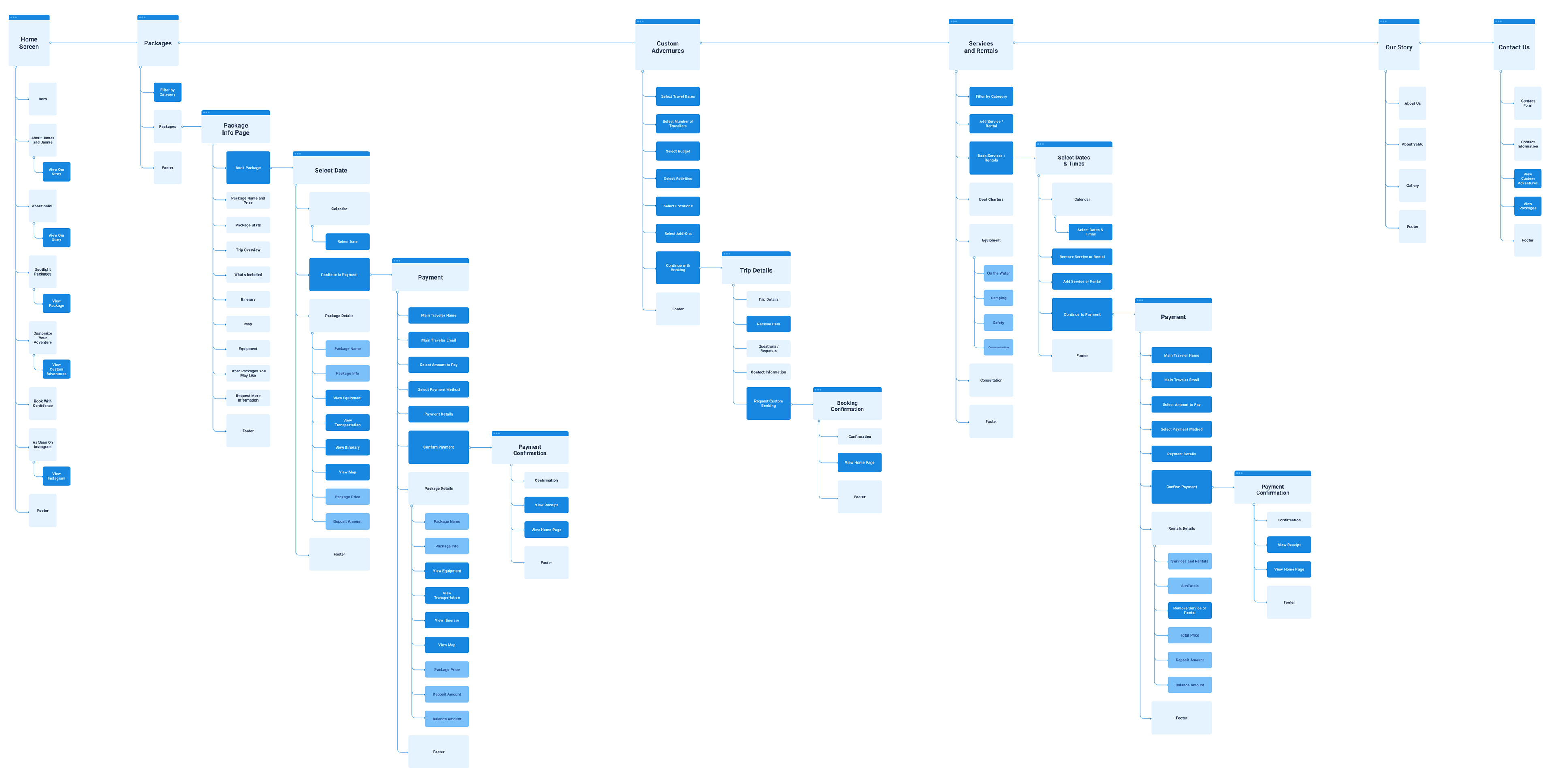
Site map
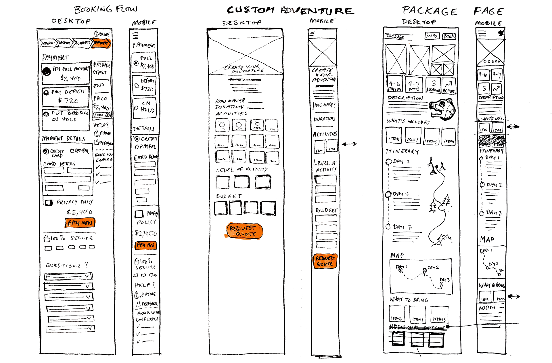
Low-fidelity sketches
Mid-fidelity wireframes
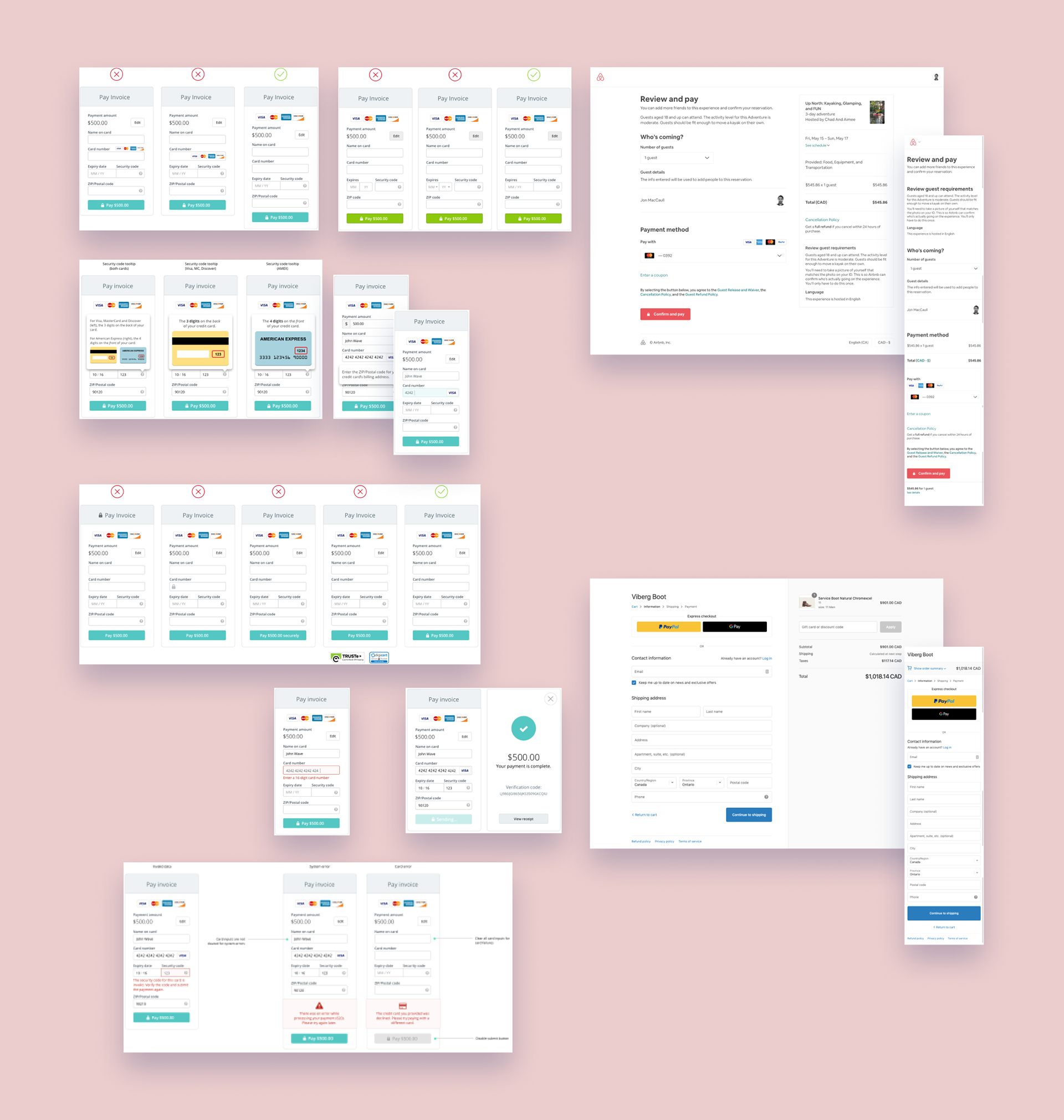
Making custom packages valuable for users
Package customization can easily become complicated and require talking directly to the tour provider. With users quickly abandoning flows that lead offline, custom packages were at risk of under-serving our users. I advocated for offering price estimation as part of the flow for custom tours, putting users in control of whether to proceed with a more detailed and accurate costing of their trip.
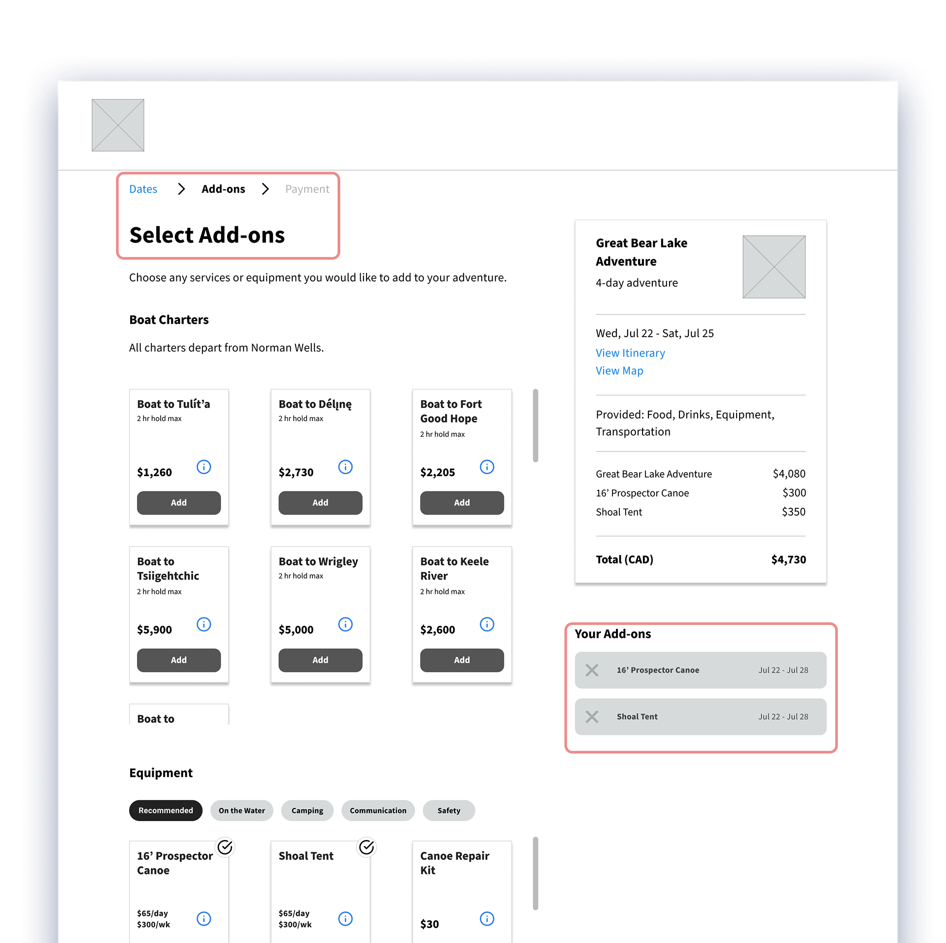
Keeping things frictionless
Our initial design had add-ons within the booking flow for pre-set packages. This led to confusion that was uncovered in usability testing. We learned from our personas that those looking for customization and those looking for pre-set packages were generally two different types of users.
Problem
Add-ons complicated the booking flow and reduced confidence.
Add-ons complicated the booking flow and reduced confidence.
Implication
Travellers didn’t understand why they were being asked to purchase add-ons for a package trip and became adverse to paying more. Boat charters complicated matters by adding extra days to the trip, which was difficult to clearly communicate to travellers.
Travellers didn’t understand why they were being asked to purchase add-ons for a package trip and became adverse to paying more. Boat charters complicated matters by adding extra days to the trip, which was difficult to clearly communicate to travellers.
Solution
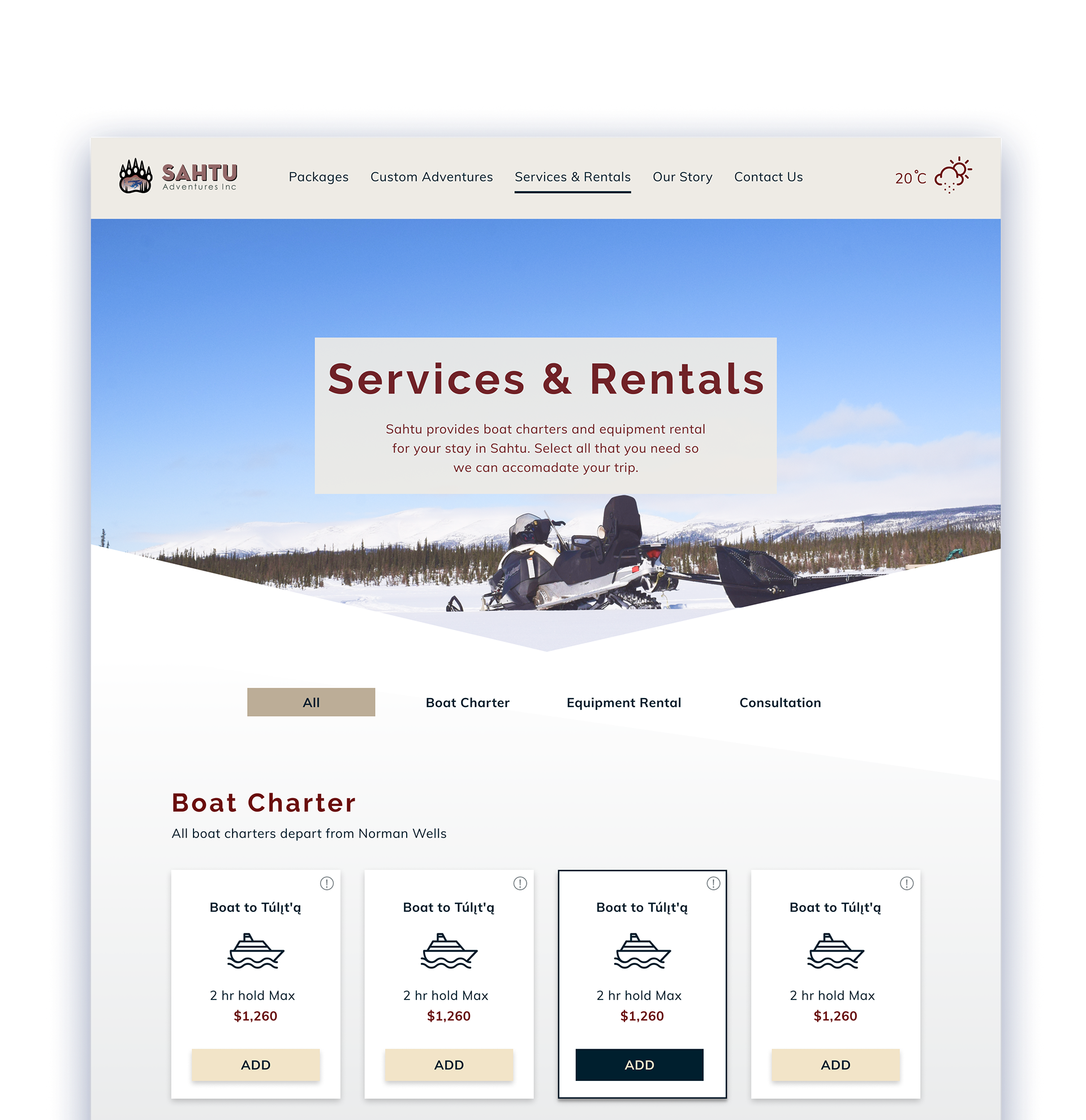
Add-ons were removed from the booking flow for package tours. Travellers can access the same options from the Services & Rentals page.
Add-ons were removed from the booking flow for package tours. Travellers can access the same options from the Services & Rentals page.
Keeping the booking flow focused increases the likelihood that travellers will complete their booking.
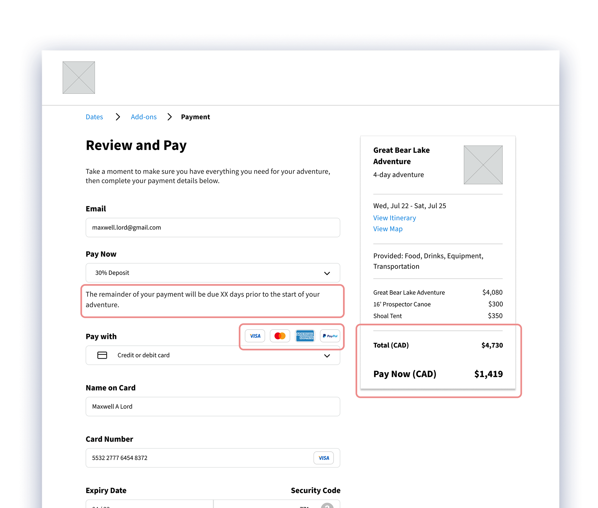
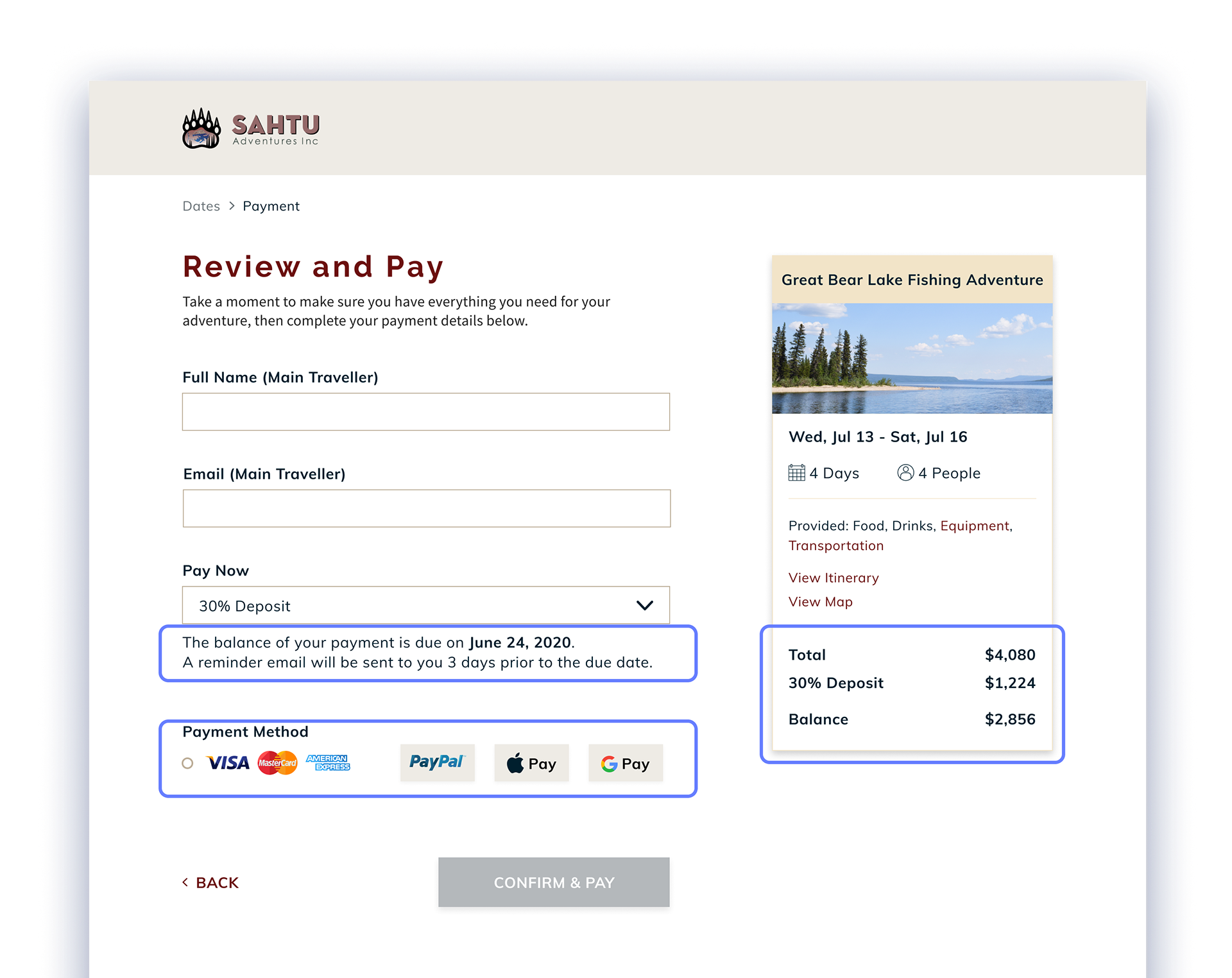
Problem
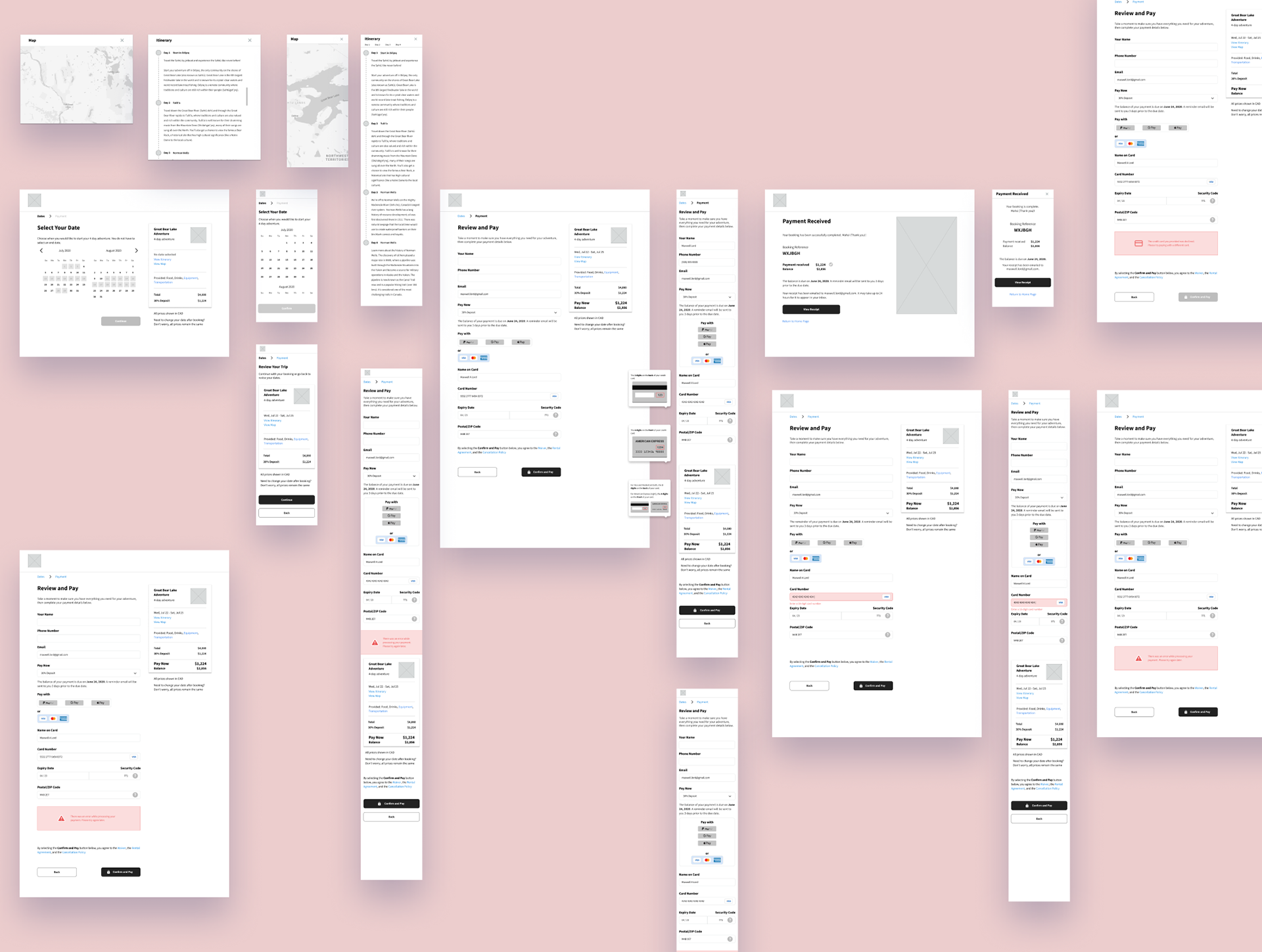
Users were frustrated by an inability to select credit card icons to choose their payment method. They also found it difficult to determine their balance and when it would be due.
Users were frustrated by an inability to select credit card icons to choose their payment method. They also found it difficult to determine their balance and when it would be due.
Implication
Without a clear understanding of the balance and the due date, travellers could lose confidence in the booking process. Frustrations with selecting payment method could easily lead to abandonment.
Without a clear understanding of the balance and the due date, travellers could lose confidence in the booking process. Frustrations with selecting payment method could easily lead to abandonment.
Solution
Payment options were changed to selectable tabs.
Payment options were changed to selectable tabs.
The due date for the balance was explicitly stated along with a message about a reminder email.
The balance for the payment was included in the trip cost summary alongside the trip cost and deposit.
Packages
The package page contains detailed information about the trip to help users make an informed decision. Their common questions should be addressed before clicking to book the trip.
Booking
The booking flow for pre-set packages is kept to two stages. First, travellers select the date when they would like to start their trip, then they move on to payment.
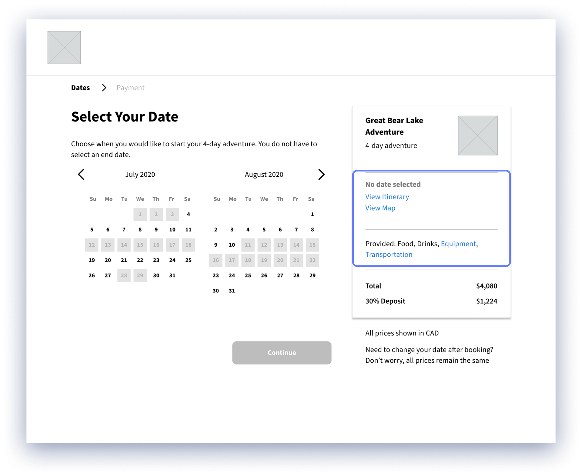
I kept relevant details of the trip, such as equipment, itinerary, and map, always close at hand via links throughout the booking flow for travellers to review at any time.

Offering multiple payment options helps users through the flow, who can pay in the way that is most convenient for them.
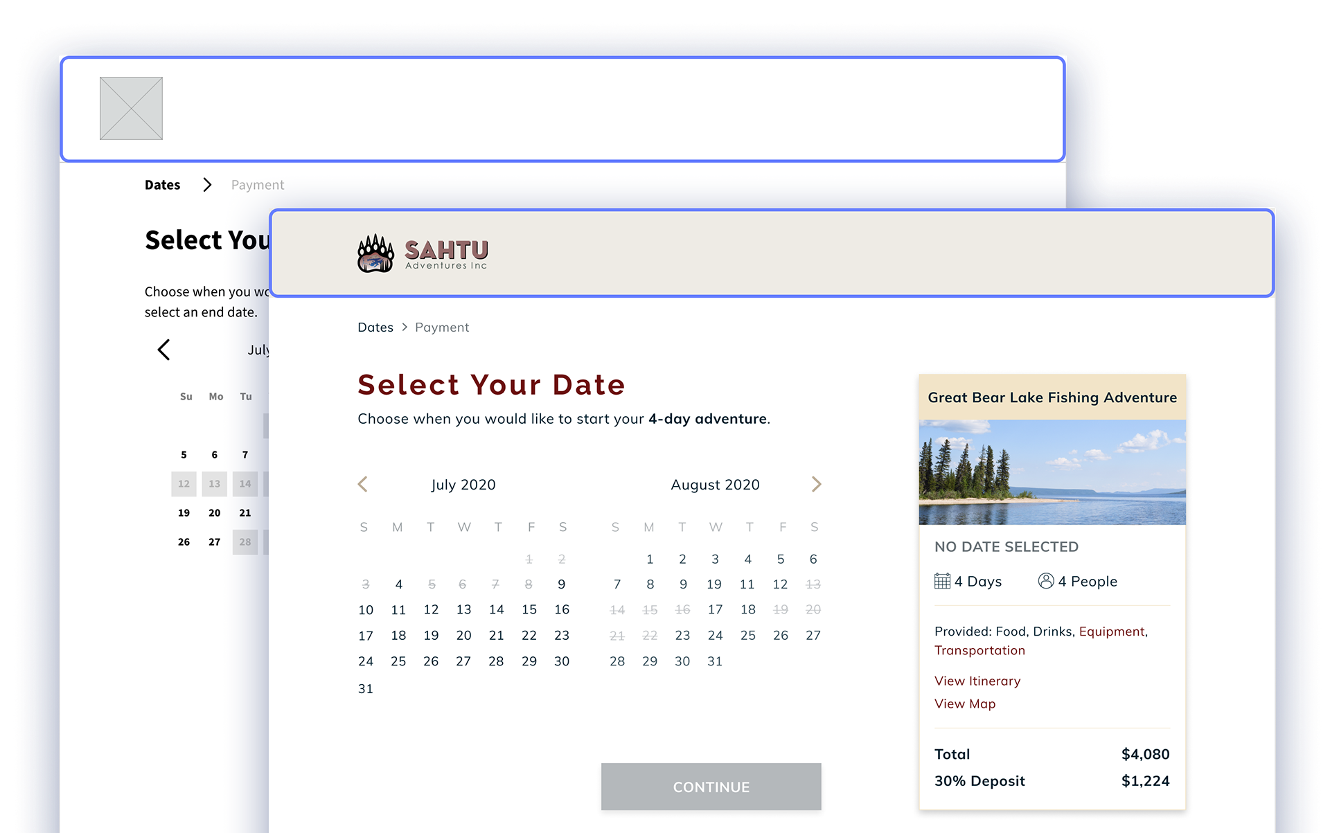
Once travellers are in the booking flow, the top navigation for the site goes away, minimizing distraction and encouraging them to complete the process.
Booking flow research

Design inspiration
Takeaway
Through this sprint, I learned the value of compromise and how to keep things streamlined in the design. I also learned the value of leaning on my team members, as I was able to use their insights to help simplify the design and trust them to manage their share of the work. Thankfully I had a great team and everyone brought their perspectives and effort to the table.
Want a deeper look into the project? Read my write-up on Medium