
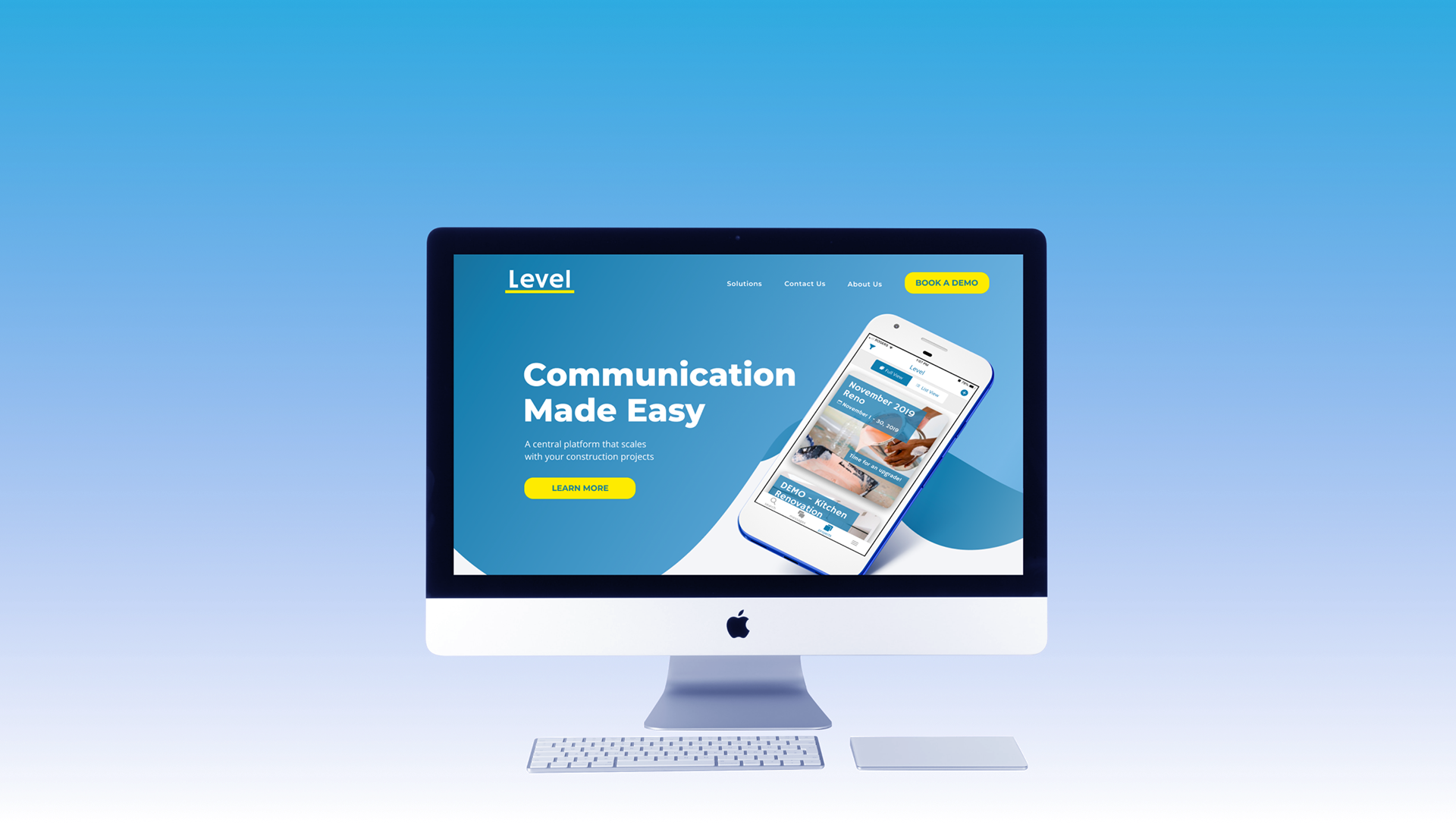
Level is a mobile app serving as a central platform for communications and project documents for those in the construction industry. Founded by Riley O'Brien and Leeroy Beeby, Level aims to simplify the complicated and costly communication process that is typical on job sites. Along with three other designers, I developed a website redesign for Level to better communicate its value proposition and encourage potential customers to try it.

My Role
UX Designer
UX Designer
Tools
Otter.ai, Zoom, Slack, Trello, Google Suite, Miro, Figma
Otter.ai, Zoom, Slack, Trello, Google Suite, Miro, Figma
Team
Cerise McKay, Murtaza Bukhari, Chiara Plastina
Cerise McKay, Murtaza Bukhari, Chiara Plastina
Timeframe
3 weeks (2019)
3 weeks (2019)
Level came to us with their dilemma: when they sat down with customers and demonstrated the app, they loved it, but potential customers were bouncing off their website. We needed to communicate the value of Level in a way that was conversational and concise.
Getting constructive feedback
I wrote and deployed an online survey to better understand what Level's potential audience was already using and what they valued in productivity apps. To find our audience I dug into Facebook and LinkedIn groups for contractors and tradespeople. We received 51 responses from those working within the construction industry.
Occupations
13 Site Workers
9 Managers
9 Engineers
7 Admin.
3 Contractors
2 Owners
9 Managers
9 Engineers
7 Admin.
3 Contractors
2 Owners
Projects
19 Residential
11 Commercial
5 Industrial
4 Civil
4 Demolitions
11 Commercial
5 Industrial
4 Civil
4 Demolitions
Pain Points
Inefficiency of multiple platforms
Disorganized inboxes
Data management
Workflow integration
Disorganized inboxes
Data management
Workflow integration
Valued Features
Easy to use
High qualityReliable
High qualityReliable
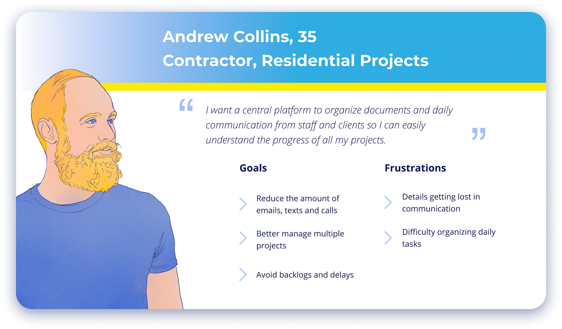
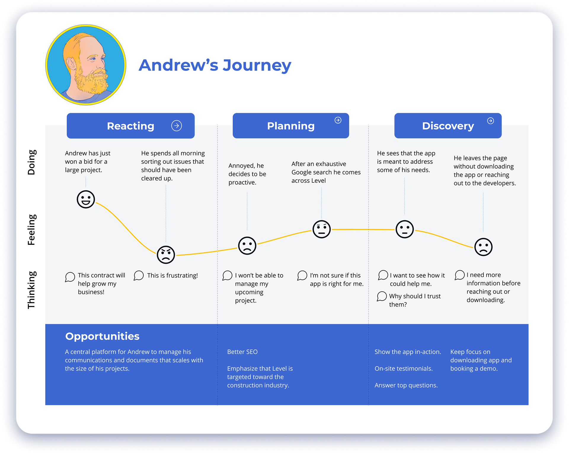
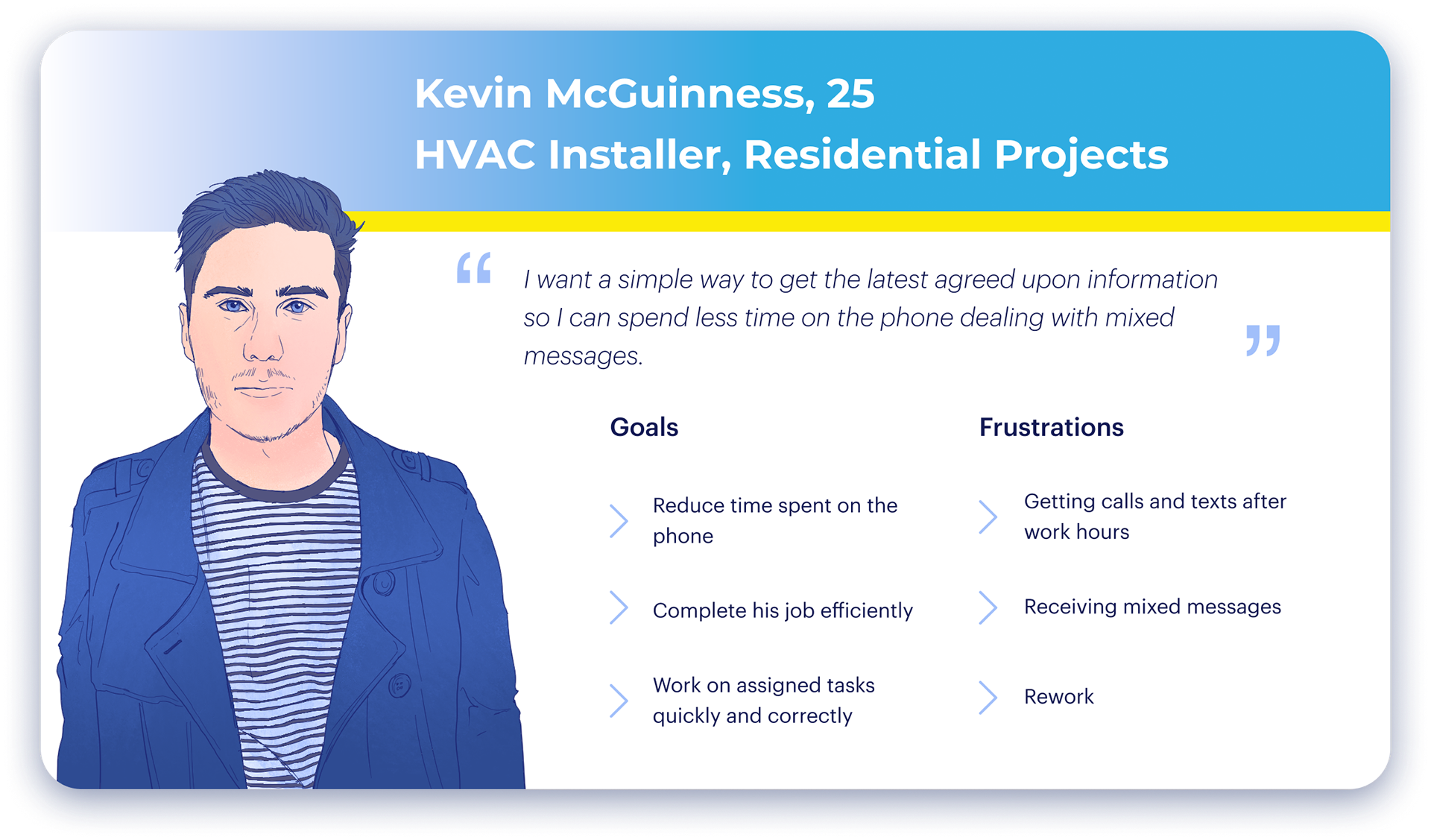
From our data, we developed two personas to represent our primary and secondary users, Andrew and Kevin. I led the development of Andrew's journey map.
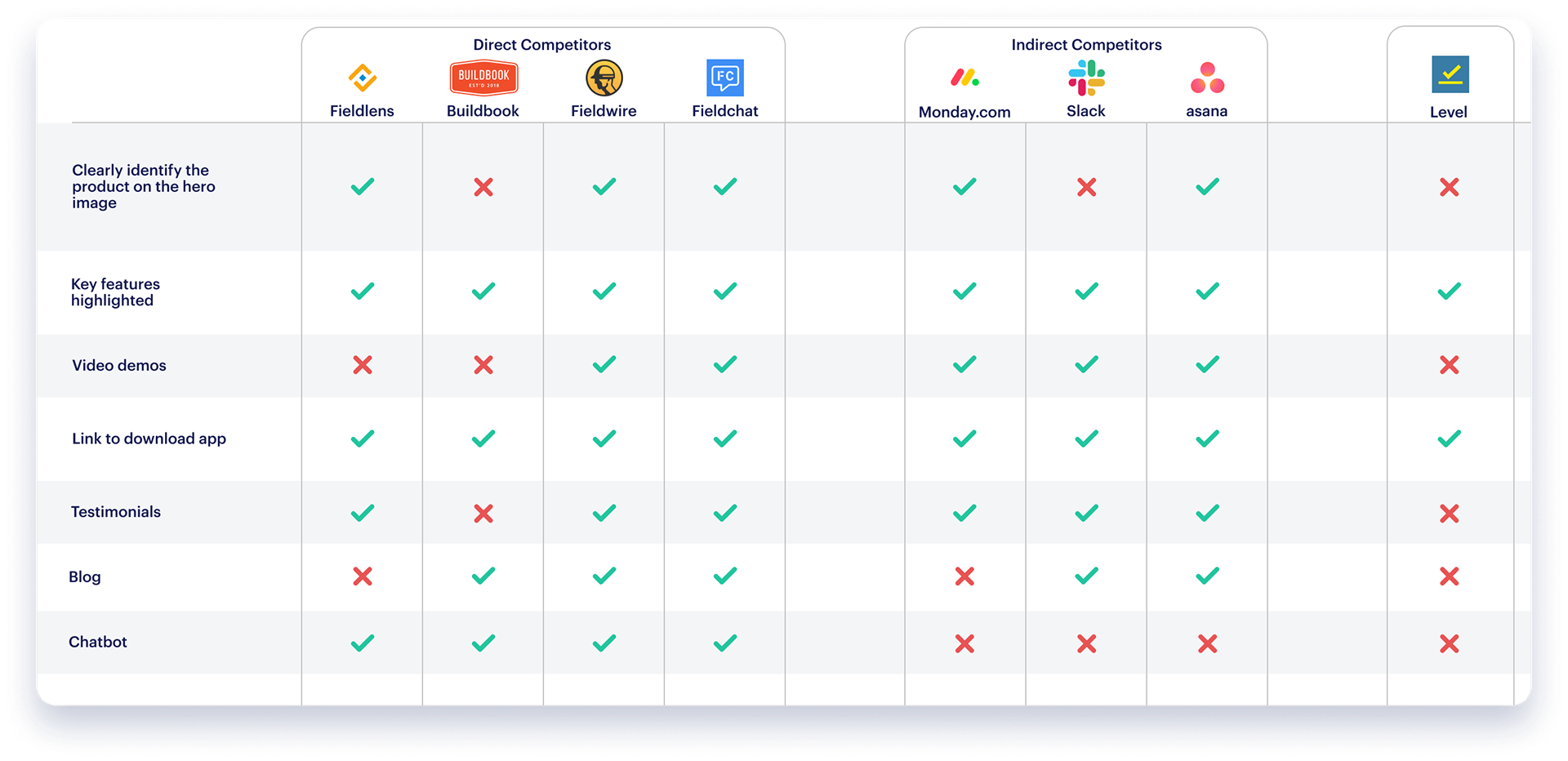
Competitive and comparative analysis
From Andrew's journey map and our competitive analysis we identified what features we needed to prioritize in our messaging.
We came up with several principles to inform the design of the site.
Emphasize Ease of Use
We vetted our messaging against this, trying to stay away from over-explanation while still addressing specific issues.

Use Social Proof
We knew from our research that word-of-mouth recommendations were highly valued in construction and trades. We pushed for testimonials to better position Level in the eyes of its potential customers.
Keep It Frictionless
This principle encouraged us to incorporate an online demo booking form.

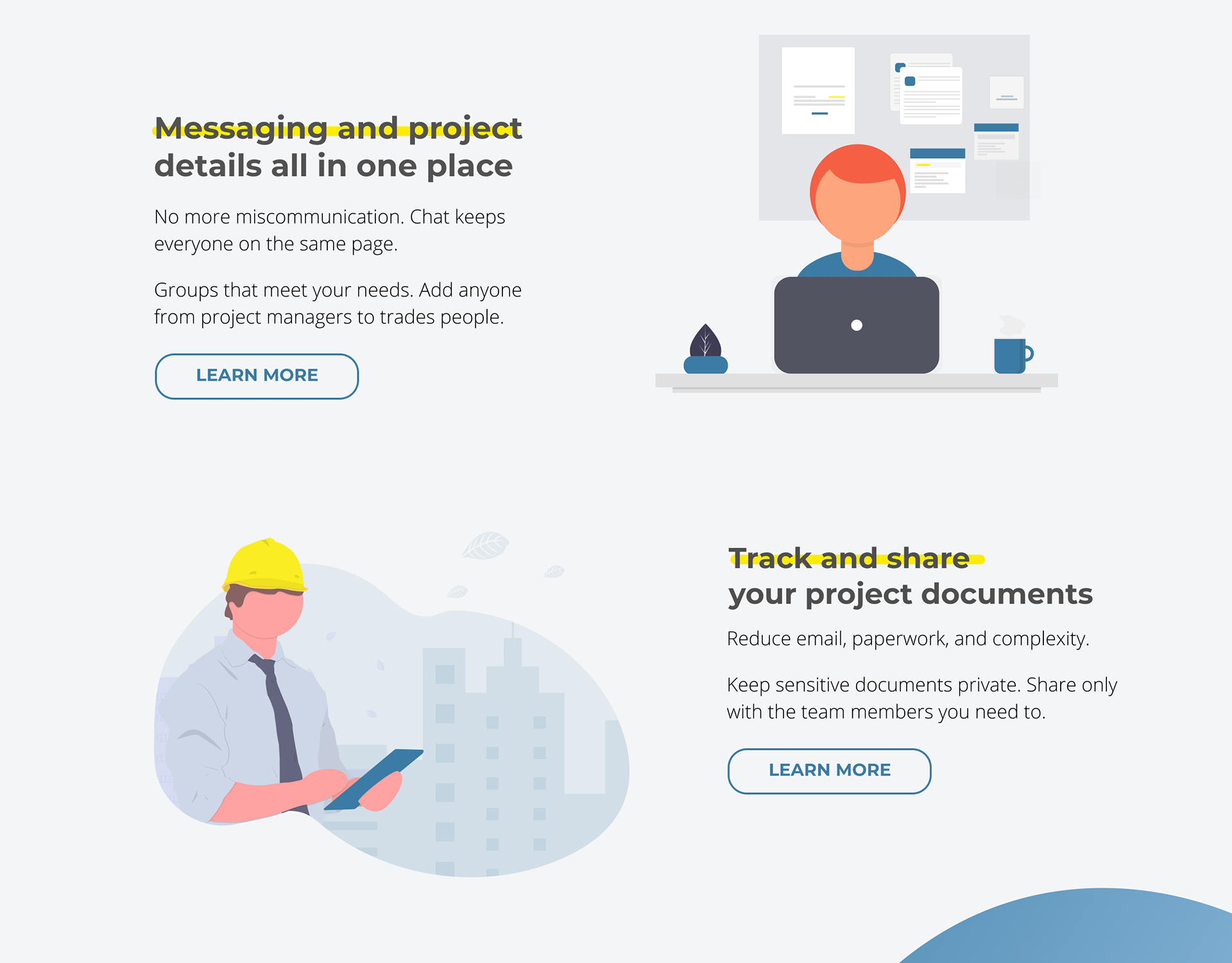
Make It Personable
Given Level’s responsive attitude to their customers, we felt it was fitting that their website should reflect this. This principle informed the addition of an About Us page and the visual design.
Finding the flow
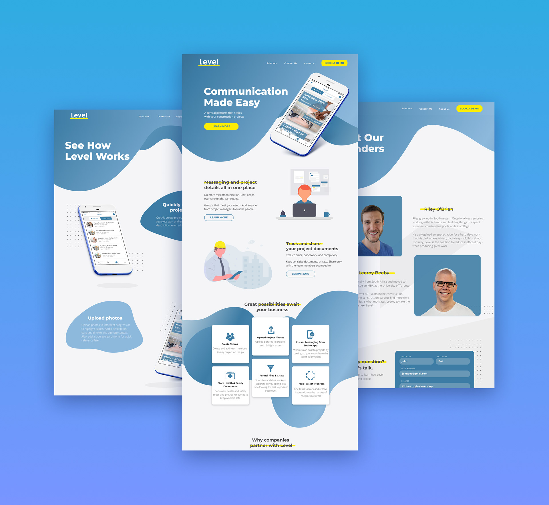
Based on our research and comparative analysis, we identified a demo booking form and contact form as features that would bring value to Level's website. I developed detailed user flow diagrams for these features.
User flow diagram
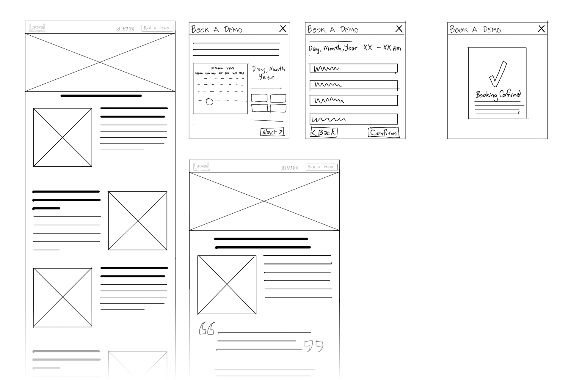
Low-fidelity sketches
The sticky site navigation allows users to choose when to book a demo without feeling interrupted by multiple CTAs throughout the page. Once users choose to book a demo, they complete a one-page form filling out their contact information and selecting their date. A simple confirmation dialogue with an estimated response time gives users a sense of accomplishment.
The contact page lets users reach out to Level without the commitment of a demo.
Speaking plainly
I contributed to the copywriting on the site, pushing back against overly vague claims. I used the information gathered in the surveys to directly inform this, speaking to the frustrations expressed by potential users.
Takeaways
Through this sprint, I learned a lot about design collaboration. While communication is vital for collaboration, the form of communication is often just as important. Recognizing when a discussion was no longer effective and when to show design ideas was a valuable lesson. I also learned the value of adapting the process to meet the needs of the design. Allocating more time to develop moments of delight for users and using a more research-informed approach to the visual design may have been wise in retrospect.
Interested in more detail? Read my writeup on Medium
Open source illustrations on this page from opendoodles.com (Pablo Stanley)